It’s been there since the update went live, i don’t know about if it was there on dev server, i didn’t play on the dev this time around.
Well update went live yesterday evening, so i wasnt able to play and see any changes. And it wasnt like that before update when i wrote the message
lots of unnecessary flash that hides the actual information.
TL:DR: it sucks
2 Likes
Is the worst, I don’t even fking know what I looking at
1 Like
I know change is not easy for many and some people’s language may be a bit too harsh but i’ll just say this:
Spending time on this kind of stuff while we have many things to be fixed in the game is just “bad”, lack of a better word.
And I just hope the developers will get the feedback.
1 Like
It was obviously programmed by someone who doesn’t use it.
5 Likes
This was made by someone who doesn’t have to use it, but has to justify why they’re employed and thus has to put in “busy work”, and who was told that the Ace Crew/XP buying needs more focus and to stand out more.
2 Likes
I said this with the last major content patch that featured the ui changes to the vehicle interface and pop up windows. I guess they actually changed what I was most mad at.
The majorest problem with the new ui change here with the crew xp window is that the dingus used some default stance on text margins.
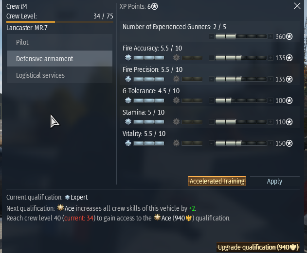
As you can see at the top “Crew #4” and “XP Points: 6*” are margined to the Left of their respective columns which might work on the eyes when you are looking square at the window like in this isolated screenshot, but when it’s shifted to the far right tophand corner of the screen “XP Points: 6*” is Center to the whole window, not just the column. This is count-intuitive for the eyes since that Center location is normally reserved for the name of the entire ui Window.
The problem is made worse when trying to visually sort the list of where to assign crew points. As you can see, the top item “Number of Experienced Gunners: 2/5” has no benefit from Qualification Upgrades, so that section is blank, and the “Number of Experienced Gunners: 2/5” text is fixed and Margined to the top Left which is no longer ordered along the same axis line as the crew points allocation bar. In other words, every time you assign crew points, you have to draw imaginary diagonal lines from the Text label to the point allocation. Again, this might not be a big issue if it were centered on the screen. I’m assuming whoever designed this was looking square at the window in the design interface. It would make more sense to have the point allocation bar below the text and the Qualification bonus on the other side. Regardless, it’s dumb. The goal was to show off the effected vehicle components which required compressing the crew skill window. This could be a problem due to compartmentalization of the team.
All other concerns in the thread are valid.
@Alx460 It’s bad even on square monitors.
The idea that UI designs are fine, and that it’s just a matter of players Progressing through the changes… it’s insane. I don’t understand why you guys can’t just come up with a good UI or make gradual changes.
The only problem the old window had was that some items on the list at the bottom were cut off and required a minor scroll down. A simple resize would have sufficed, but it got an entire revamp.
The color decisions are the most obvious indicator that whoever is making these changes has no idea what they’re doing. Even the Plus button looks like part of the xp bar, so having a filled xp bar looks partially blank because of the dark button.
However, the bottom portion is not bad because the xp bar is more prevalent and clear. The Left margin makes sense for the “Current Qualification:” portion because it’s not a split column window. That being said, it would still be better off Centered imo, but there’s not as much confusion there. I find it boneheaded that there is no xp tally indication (like “You are at 110,037 xp toward next Qualification: Ace”), and when you hover over it, you get redundant information about the expense required per step, which is once again, completely boneheaded, another total indicator of incompetence in design.
7 Likes
The old one was bad. New is terrible. I like the info what the max lvl is.
A step back from the old UI imo - You can no longer select aircraft, tank or ship tabs in the crew skills menu, nor see what vehicles they’re trained for.
4 Likes
You guys should be trying to create an entirely new viewing mode of vehicles with a separate option like
Change Vehicle
Modifications
Customizations
Test Sail
Crew
Information
and add your dream window: Inspection
or something. Might be too close to “Information.”
Then have the vehicle screen pop up with the list of components/crew with the mouse hovering visuals. Integrate it with the x-ray tab or something.
Integrating it with crew xp is just spastic.
Addition:
You also don’t know if you have the lions for the crew training until you either hover the icon or try and click it. Kind of annoying.
1 Like
The only thing I would have liked added is this:
When you hold a vehicle with the mouse in the hangar, you currently get to see for all your crews if the crew is basic, expert or ace.
What would be needed is a miniature ace progress bar under each crew with expert. So that you can easily see where this vehicle will reach ace quickest. THAT would have been an improvement.
We got FUBAR instead.
3 Likes
This is not an upgrade but a downgrade, they made it way worst to read the informations, and also the fact that is not in the center is terrible layout.
4 Likes
Okay, given the copious amount of criticism I’ve seen (and partaken in myself) the past day, let’s put it to a poll:
- Bring back the old UI
- Keep the new UI
- Give an option to switch between UI’s
0
voters
5 Likes
Option #4:
Just add back the same functionality as the old crew skill point screen. There is no reason not to have kept the parts where we can view other vehicles already trained on the crew slot, and switch between Air Land and Sea crew skill sections.
Everything else is just visual/personal preference. But these two functionalities are very important and make the new/current crew skill UI a huge step backwards. These two are even more important than the Ace Training point display.
3 Likes
In glad its not just me then who is not a fan of the text colors and positioning. Its much harder to see at a glance. It definitely was much clearer and cleaner cut with the old menu. I hope the devs see this thread and either revert back like they have some changed that the community did not agree with or take into some consideration that not everyone plays on a 4x3 format cube in the game and lots of people play on 16x9 2k,4k and stretch monitors.
2 Likes
Once again, this “enhancement” was decided and designed by people who NEVER played their game…
6 Likes
There’s another problem. They added buttons to mouse-hover info window popups on vehicles, so they linger when you move your mouse over that menu instead of fading when your mouse leaves the vehicle. So you can’t click what’s next to that vehicle until you move the mouse across the mouseover popup to get it to fade off. It’s maddening especially at vehicle selection screen in battle. You can’t click through it!
2 Likes
Awful changes.
The vehicle panel was a step backwards (cluttered / dense, long names move back and forth as an added distraction, etc.) but the crew panel is even worse.
Less information in a significantly larger panel… and somehow made it visually more confusing and difficult to parse.
The previous UI was relatively compact and displayed all the necessary info in a easy to understand format. It even showed you all the vehicles you’d qualified / expert / aced (including the actual points towards ace) in a simple scrollable table. Where can I get that info in this horrible ‘improved’ UI?
The interface has been going downhill for a while. Must be scraping the bottom of the UX management barrel now.
6 Likes
Hard to read, showing Expert and Ace skills before normal skills is confusing. It’s glued to the side of the screen which is awkward.
2 Likes