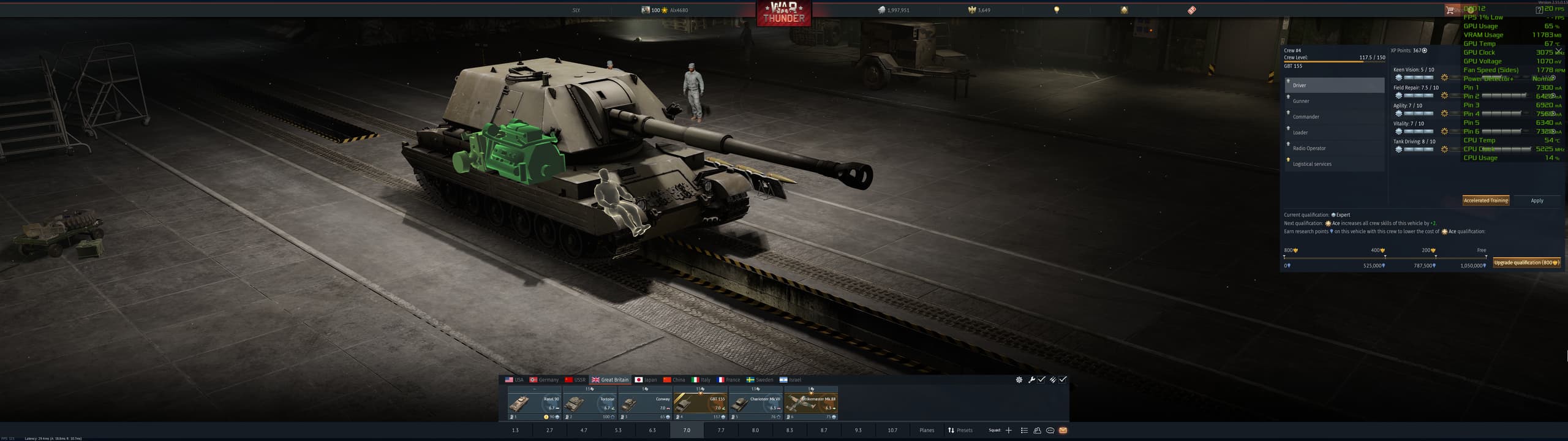
Also, noticed after few games, the shades of grey between applied and unapplied crew points in the bar are so close to each other I struggle to even see them unless fully focus my vision in every single one separately.
If I’m struggling with my strong near-sightedness then how the hell someone with even worse eyesight problems can even use this crap?!
It’s worse in basically every regard and for no good reason. It’s more cluttered, less informative, removed functionality such as seeing the crews competency when it comes to other vehicle types, now requires scrolling down, etc.
“We made stuff worse, removed a bunch of functionality, made it more cluttered and less informative. But if you look hard you can find some of the things still exist.”
Literally give us the old one back. This one looks worse, works worse, and seems like a straight up worse version.
I do not have any influence over development, no insight into development and no contacts with the developers. Game Masters handle in-game chat and name bans.
I simply wanted to show the player that some of the information they thought was gone is still there but in a new place.
I agree with some of the points here but i also think many are exaggerating about it.
What is the way to provide feedback, even? It’s not a bug, and starting a suggestion thread seems spurious (not that I’d expect it to be approved when even legitimate requests can get stuck in pending forever). Yet it is a genuinely harmful change and rolling it back in full would be a significant improvement over its current state.
Honestly, I always try to find something positive in updates. I usually tell the community, “well, at least they improved this or that,” and so on. And sure — the new map, the new effects — maybe there are some solid technical improvements there.
But then, out of nowhere, you drop something like this Crew skill table rework, and it ends up removing half of the functionality.
Guys, this is not how updates should be released. Let users share their opinions. If you don’t want that, then at least let real players test the functionality first, gather feedback, and only then implement it. Not this approach of “we made it, we messed up, but now we’ll just leave it and people will get used to it.”
The Crew upgrade system used to be just as convenient as modifications. Now it’s pushed aside. You can’t clearly see how much free XP you have or your total XP, the buttons are too small, and the whole layout feels like something generated without any real UX consideration.
Please, developers — enough with this kind of approach.
You’re already doing it, the Community Managers gather feedback they see here on the forum and if a lot of players are talking about the same thing and want similar changes they pass it on to the developers as a suggestion for change :)
You can click the vehicle in the clot, click “Change vehicle” and then check the “mastered crew” checkbox to see a list of all the vehicles that crew is trained on. Many here would like the old list in the Crew qualification tab back though.
While the mods page stays unchanged, no harmony at all. Honestly this version are just like being forked from original Thunder.
-AND THE RADAR SCREEN. On modern radar sistems they are just being displayed as a needle-head-sized icon. and in-match UI, showing player vehicle. and it lags. wth? It looks like devs are doing vibe-coding.
Wasn’t saying you did, was just disagreeing. And I also disagree on it being exaggerated. It literally is a downgrade and worse in virtually every way. Hell, the “Buy XP/Ace crew” part now takes up almost 25% of the screen. Which feels like the only reason this happened.
Thank you, but I knew of this method. I’m talking about click on crew and then see all vehicles, with points allocated, where I could select from crew menu where to allocate the points, It was much easier to manage the points. Of course I prefer also the old menu. I think this was an uninspired way to improve the UI.
My issue is the ability to swap between the Air, Ground, and Naval skills. That was possible with the old UI.
Now, you have to switch your lineup using vehicles for that specific game mode. Just to observe and add points to use for it.
Did they forget about a scenario for those that already max their crew skills, and want to dump those extra points for another game mode? Doing it this way now is more of a burden for the user. They should have been caught this during the testing phase. While it is not a bug, but it is a QoL feature that benefits the user-experience.
Let’s take in-match UI as another example. You enter a match, want to see someone’s vehicle, press tab, move your cursor on that name, and a window pop up.
Now you decide to move your cursor away, rightward. What does this mean?
A. You end up inspection.
B. You want to rather check this guy’s(or other guys’) username/profile.
Guess what? Our dear Gaijin decide that you want this window kept there!
Have the UI devs ever thought about ‘why users make that move’? This is not even a problem of art style preference, but whether there’s still any sanity! :(((((
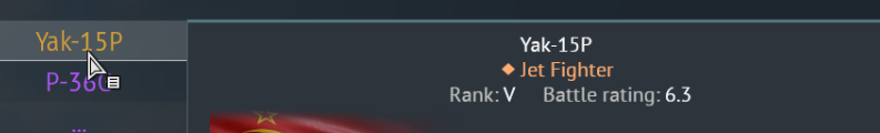
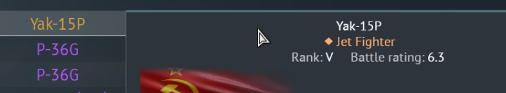
This is one of the biggest issues with the new Crew Skill window. Also, you cannot see the other vehicles you have already trained in that slot anymore.
Can we please get an option to re center the ui? it is absolutely insane having it on the far right. if you have any sort of an ultra wide monitor it is not even near your tanks. If you are using any kind of overlay the menu gets covered and you need to hide your data you keep open just to see the game stat card.
This member group interface makes me feel nauseous and want to vomit. It’s hard to imagine how there could be such an ugly UI in 2026; it makes me physically sick.