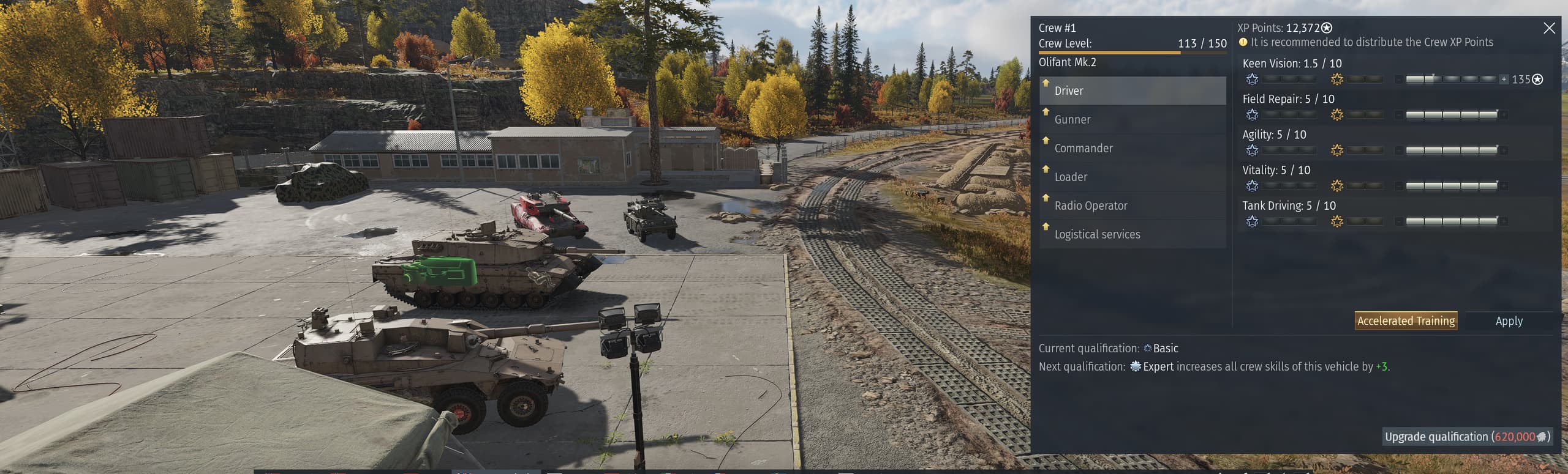
what do you guys think about the new crew skill point ui?
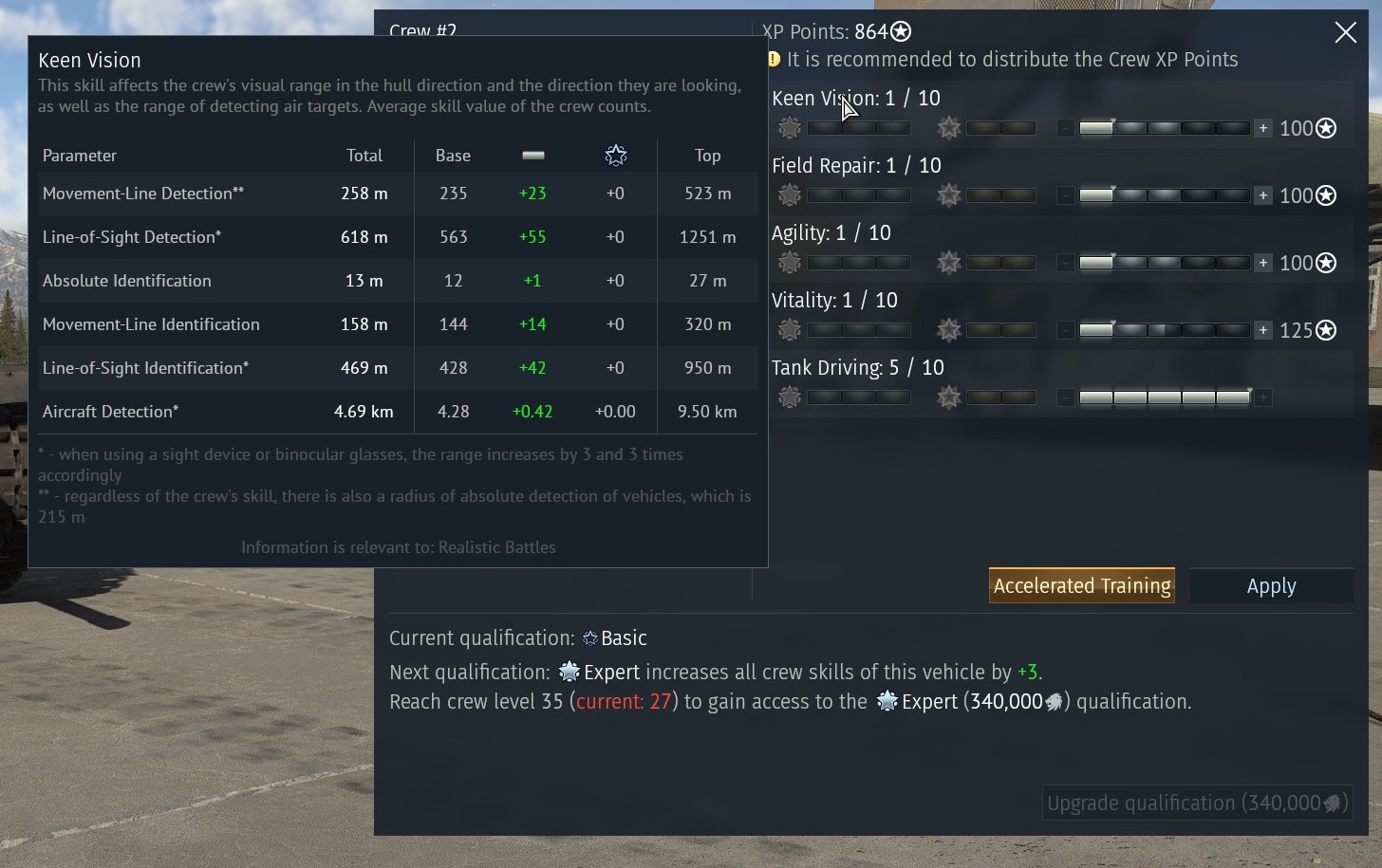
I believe they should add information about the skill point`s impact. Cuz now you only know, for example, how fast will you reload only when already spent points.
16 Likes
Only addition I liked is the reverse speed lol
i agree, honestly im finding it a bit confusing with the extra bars now
5 Likes
I hate it the most , absolutely unnecessary
24 Likes
I think it’s ok in general – I just gotta rewire my brain to the new format.
This is still possible, like the old version of the card. You put the points in like you would to spend them, but just don’t hit the Apply button. Then hover over the skill and it shows the incremental increase.
But, if they can make the crew skill panel so wide, I don’t know why they don’t make the vehicle stat card wider so it doesn’t need to have side-scrolling text on the weapons.
4 Likes
Needs more colour and contrast as it’s all shades of gray and everything blends together, the actual skills need to swap places with the expert/ace skills so you and the +/- buttons for the skills need to be bigger.
Honestly though I would rather bug fixes then this changing UI for the sake of changing it, the only one was perfectly fine and frankly far easier to use, all the info was just there, the new one you have to keep screwing around mousing over stuff to see how much effect skill increase have etc.
4 Likes
Pure stupidity!
It was fine, so they had to mess it up. Previously, you could see all the vehicles trained for a given crew, their progress towards AS, and you could manage a plane/tank/ship crew simultaneously without the idiotic need to switch vehicles within a given crew to see their training for a different type or simply spend points along the way.
31 Likes
It is honestly obtrusive and missing clear at face information, all the previous ui needed was better wording and enlargement.
8 Likes
So in exchange for a extremely offset new UI without contrast and everything being a similar shade we have lost the ability to cycle through tank, aircraft and naval crews and view what levels they are in things?
And we also lost the ability to see how many vehicles this crew is trained on?
Why are we loosing major features in exchange for a fresh coat of paint?
Our profiles are still barebones compared to the old one which packed the page with info and now I have to jump through multiple steps to decide where to distribute my XP?
It also really doesn’t look great on ultrawide screens.
Don’t revamp things by stripping major features away.
42 Likes
confusing, i see no improvements over all
8 Likes
Its actually a loss of functionality.
10 Likes
They should have fired the UI team since looooong ago
7 Likes
I despise it. The elements that you actually need to interact with are the the furthest, smallest, least noticeable ones, and the screen itself is a misshapen mess. It’s instantly unpleasant just to look at.
Please tell me there’s a way to get rid of it and bring back the old crew window.
18 Likes
Its garbage like everything UI team does
14 Likes
Why the hell they had to remove the ability swap between Air/Ground/Navy tabs in the Crew UI?!
For example all my US and UK air crews are at level 75 so I’m using the XP gained to level Ground and Navy crews, but now you have to fully change your lineup just to see the crew levels of other branches instead of quickly checking the different tabs.
This is exactly same crap as the Player Profile changes that were never fixed depite the complaints.
BVV_d and the idiots behind this “Don’t fix what needs to be fixed, but fix what doesn’t need fixing” -policy should be fired.
19 Likes
At least keep the funcuality is that not the point of a reskin?
to keep the function but make it look better?
personally i find this a terrible addition much like most other things recently added
but the new profiles would be great if they would keep all the info (algough they only moved it to another screen.
3 Likes
Where do I switch between air, ground and naval? Is that switch GONE?
You have no more access the the ace status list of the experted vehicles, unless you move the vehicle in to the slot.
Edit: Yes. Incredible. What a shit! Why did it need change? And who came up with this shit?
Give us a switch for the old interface.
14 Likes
You used to be able to see your ace crew improvement even if you weren’t 60 lvl. Now that is gone. Are all of my ace crew improvements gone? This is ridiculous!
4 Likes