It’s my day off from work, the first thing I got annoyed with is not the multiple losing matches, it’s this menu…please option to put back the old UI, I can manage crew level in air, land, naval in 1 to 2 clicks.
3 Likes
i don’t see why they decided to change it. it was fine as it was. weird pointless change
4 Likes
The more I use it the more I hate it, rather than getting used to the new layout I’m just finding more ways that it’s worse than the old one.
2 Likes
I can see their reasoning, and what they are trying to accomplish, it will be better for new players IF they bring back the two missing features: ability to see ALL the other vehicles of the same type that are already trained, AND add back the ability to change between Land Sea and Air on the Crew Skill UI.
Some have said they do not like that it is locked in place, I tend to agree, I would like it to be dragable. And I also think it would be a big plus to be able to resize it.
2 Likes
Gamers are dead?
Better for new players?
NEW PLAYERS
HOW OLD IS THIS GAME
This^
What’s the point of showing the same information about GE price when hovering the mouse cursor over the xp bar? I’d like to see my progress in the total amount of RP gained, but noooo…
Who’s designed this, drunken AI?
It looks horrible. Too cramped, and poor use of actual screen realestate on wide monitors. And what is supposed to be the focus of the interface is pushed all the way off to the right instead of being dead center?
Illogical and inconsistent order of the bars

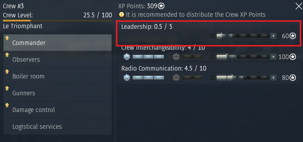
The expert and ace bars are before the base skills. But not everywhere, in the hover over popup, the order is reversed (the old, normal, logical progression). So it creates a very inconsistent and illogical design that just makes it look like no real thought was put into the design other than highlighting stuff you can pay for.
Also it creates odd appearances like this
where there is just empty space under the actual crew skill label.
And you removed the ability to swich between crew types.
Removed the ability to quickly see which slots are trained for which vehicles, meaning we now have to slot a different type of vehicle to see the cew skills for that kind of vehicle.
Please revert to the old design or HEAVILY rework the new one taking these points into consideration, because this is just objectively worse without the features that were removed.
8 Likes
Any official response on this? Developers, you NEED to revert this. Leveling up crews was actually one of the reasons I keep playing the game (after already finishing 3 tech trees), and it’s completely trash now. It’s unbelievable. How can this have been accepted by whoever QA tests?
2 Likes
Its just another case of the people updating the game not testing there own product with a larger audience or not listening to feedback
1 Like
there are thousands of bugs that need correcting in this game, but noooo, let us spend precious resources messing with something that did not need changing.
fucking cunt move, gaijin
3 Likes
On the old TAb that had the list with the vechicles your crew is trained , you also had the progress bar to ACE for each one of them.
This was extremly helpful given the amount of vehicles we have in WT, the X10 counties and the X10 crew slots.
Also now you don’t see the point acumulated towards ACE, only the progress BAR.
3 Likes
I fucking hate it - it’s somehow just offensive. The old one was better.
3 Likes
they broke something that didn’t need fixing, but thats gaijin for you, break things that don’t need fixed but when somethings actually broken they wont do anything about it :P
1 Like
Subject: Feedback on the new Crew UI – Request for the return of the “Crew Overview” table
Dear Developers,
I would like to provide feedback regarding the recent changes to the Crew user interface. While I understand the effort to modernize the look of the game, the new system has significantly complicated a core part of the gameplay loop: managing and comparing crews for a specific vehicle.
The Main Issue:
In the previous version, I could see a clear table showing the status and level of all my crews for a selected vehicle at once. Now, this information is hidden or requires much more clicking and menu navigation. It is no longer intuitive to quickly identify which crew is the most experienced for a newly unlocked tank or where I have the best qualification.
My Suggestions:
Revert to the original table: Bring back the classic “all-in-one” overview for crew skills and qualifications.
Hybrid Solution: If the new UI is to stay, please add a “Summary” or “Comparison” tab that allows us to see the progress of all available crews for one vehicle on a single screen, just like before.
The current system feels like a step backward in terms of user-friendliness and efficiency. Please consider bringing back the transparency we had with the old layout.
Thank you for your time and for listening to the community.
7 Likes
I dislike that I cannot at a quick glance see what vehicles the crew has qualification/mastery/acing of.
So, I consider this a downgrade.
4 Likes
Why does the Qualifications (basic, expert, ace) get more prominence in the UI? It’s the opposite of what I would look for.
The crew points ASSIGNED should come first and be more prominent, as that is what we (at least I) look for when opening up the crew UI. To determine where to assign my accrued points.
1 Like
You just gotta love how BVVD promises to never change the interface, but because promises need to be broken they go out of their way to make it worse. Why can’t he promise to never improve heli pve, hit registration, any naval gamemode or the servers?
3 Likes
It is SOOOOOOOOO BAD that I think they just want to prove how much they hate us.
If they liked us, whoever presented that would have been fired.
Whoever approved it would have been fired and sentenced to prison time.
I would say “what were they thinking” but I know what it is, “WE HATE YOU!”
Here’s the thing, I do not want to read all these replies and they are closing peoples threads with this question.
All I need to know is are they taking our ACE RP now?
It is GONE until you get to required level for upgrade.
So while it is invisible, is it stolen RP? Another nerf?
Or will it show up later with all my hidden RP dumped in?
4 Likes
for me this is easily the worst UI change i have seen gaijin make. im not hard to please, but this awful. honestly i don’t even want to look at my crew skills anymore.
5 Likes
I think you disclosed the sekrit plan.
1 Like