интересно получилось
even worse for a 49" super ultra wide
2 Likes
Try doing it on a 57…its so so much worse
1 Like
The only positive change is that it highlights relevant vehicle modules/crews when in a tab, which I don’t really see as that useful.
Everything else is just a straight downgrade: contrast between allocated and able to be allocated is much worse, is annoyingly on the right side, can’t switch between vehicle branches to put points into, doesn’t show a list of all crewed vehicles on the slot, doesn’t show exact RP progression to ace crew (and no way of seeing at all if your expert crew is below purchasable ace level), and the expert/ace qualification levels are added to your base levels making the already bad contrast worse because you have to do the mental math on your total levels to find base level or look at the bars.
Just a horrible change in all regards and it would be great if Gaijin stopped ruining stuff that is working fine and fix the stuff that needs fixing.
2 Likes
It is very confusing. Bring back the old UI team, they knew what they were doing.
2 Likes
(actually mine is 49" too - typo in there)
Suggestion not approved because apparently saying the interface should be in the centre of the screen because it is a PITA to use where it is now isn’t clear enough for them.
Not sure how it could be clearer ffs… :( Perhaps someone else can have a go.
1 Like
I hate this new UI
2 Likes
Hate and Hate+
2 Likes
Any updates on this
Apologies, i did not see thaf. I wonder what they are asking for to try and get that correctly submitted as a suggestion.
I’ve had a quick scan through this chain so sorry if I missed it.
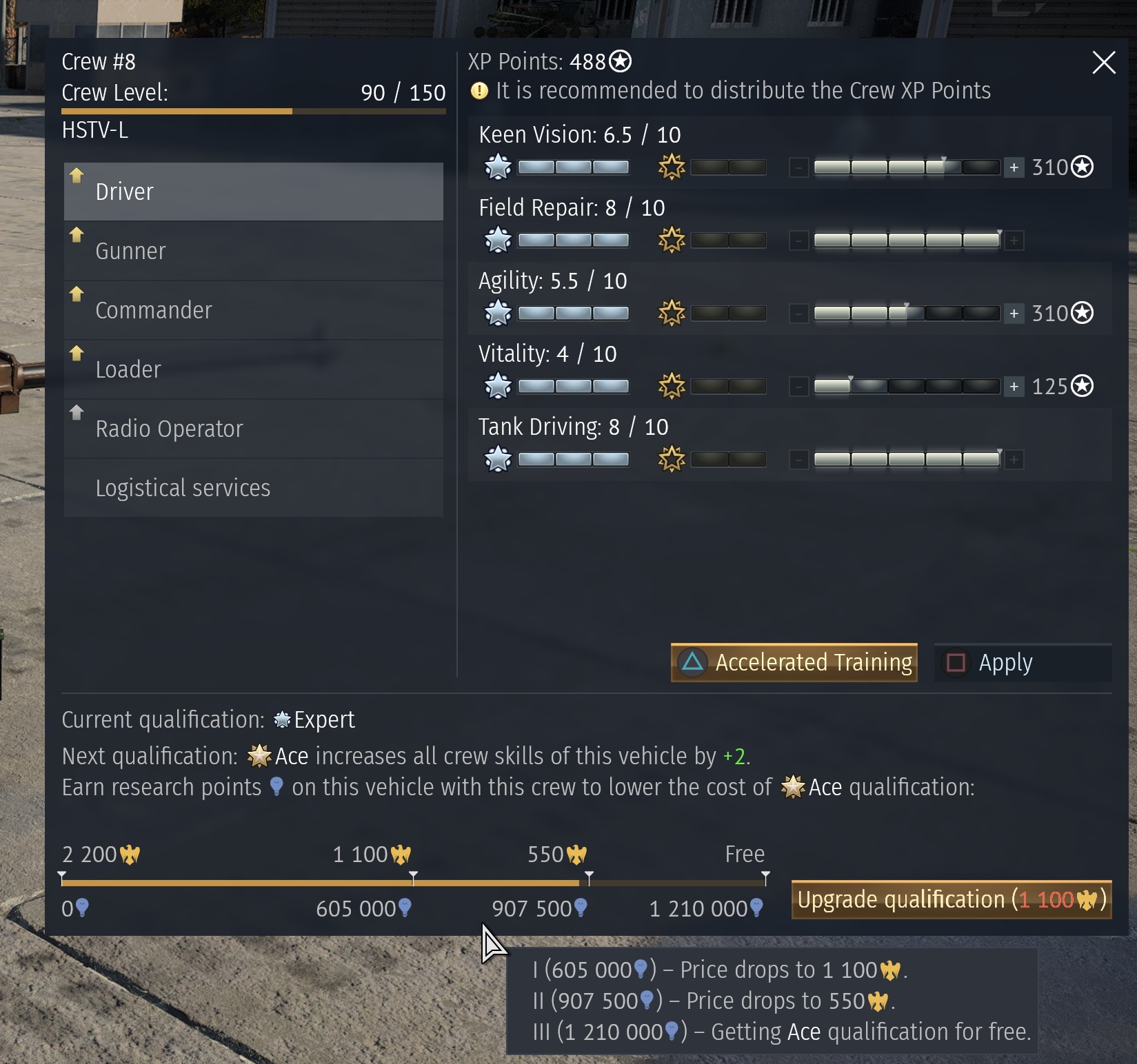
I’ve also been putting up with this major QOL downgrade and trying to work with it but, I have an issue I can’t see a work around for, and I’m hoping someone else knows how to find it on this DS crew UI.
I have a few tanks with multiple crews “experted” on them. How do I see which crews are closer to Ace qualification so I can concentrate on upgrading the crew closest to Ace? there used to be a handy bar regardless of crew level, now it seems you need the crew level required to ace to see your progress.
Is there a way to see it early?
And does anyone actually know why they downgraded it? I’m assuming they don’t like me spending real money on accelerated training!
The new ui is so fricking bad like. Like how am i supposed to see how exactly how much rp i have left till the next ace level, this is something that i liked alot with the old ui. As it was possible to see exactly how much rp you gained.

3 Likes
Dear Gaijin,
The new Crew Level system is inferior to the old system by a marked degree.
- Primary - We cannot see our progress as a numerical value towards Ace qualification. This must be restored. For one thing the lack of transparency is a problem.
- Secondary - We cannot see all the values on a Crew slot, without individually visiting each vehicle, one after the other, which is time consuming. This should be restored. Why make life harder for players?
- A more minor complaint, the new ui is bulky and ugly.
Why the downgrade Gaijin?
4 Likes
I reported the bug that UI has no actual RP number.
https://community.gaijin.net/issues/p/warthunder/i/5ceQgZGwwCAe
2 Likes
It sucks. Last time I checked, I couldn’t switch from air to ground. Extremely annoying.
2 Likes
The new UI is so God damn awful. It’s a legitimate downgrade in almost every way. The visual look is absolutely awful and the lack of ability to switch from vehicle type is horrendous. I have maxed out air crews so I loved using the old UI to put crew points to my tank crews. Now I have to physically put a tank into that slot, assign points, and then put the plane back into it. This isn’t a “New thing new, new thing bad” scenario, the new UI is just a downgrade.
2 Likes
Another thing i have noticed is that when adding points to skill perks it no longer tells you how it is changing or affecting your skill. Like before you could see how many seconds you would shave off of reload, gain in turrent traverse, gear shift and etc. Now all you have is ahh yes my crew is skill level 5 plus 2. Great that tells me how much of a buff im getting from the stat.
2 Likes
I hate that new crew system, I want old way back not new one. It is really annoyed
I hate it. They removed functionality by removing the option to switch between air/ground/naval + seeing expert progress+trained vehicles. Made it harder to read with the information it gives, and made it more annoying to look at because of how offset it is.
its a downgrade in every single aspect.
1 Like