I agree.
Since long time i try to ask this.
But mods do not accept it.
That was my asking :
Hello everyone !
I’m here to ask for a mix of the actual aiming and of the old one.
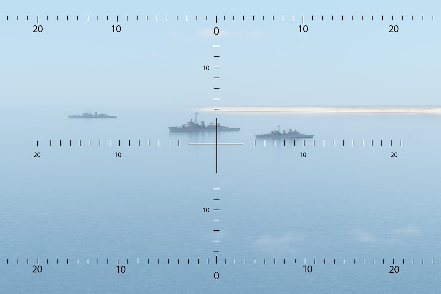
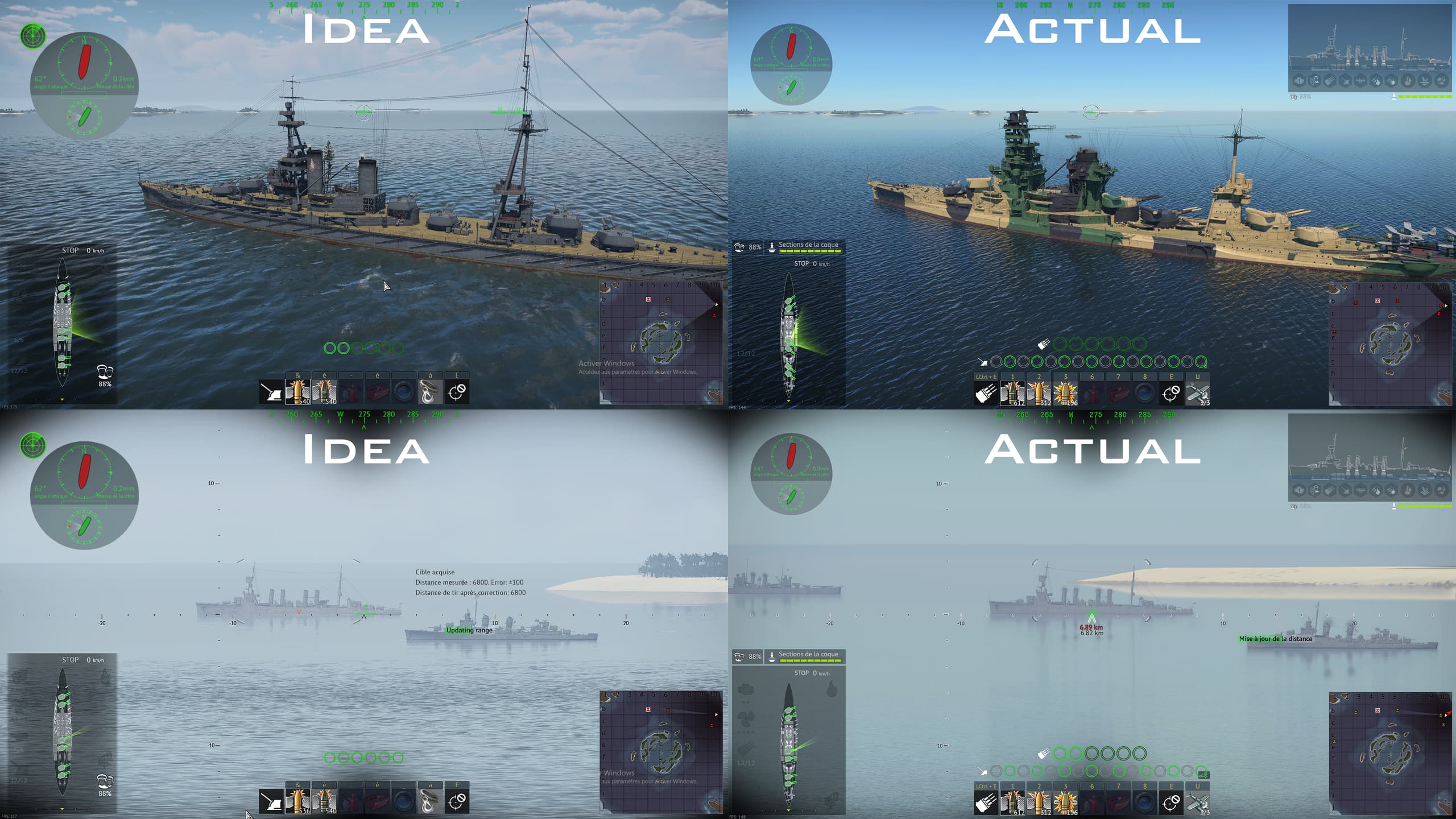
Old interface
The old system had several strengths that made it genuinely effective.
One key advantage was that you could see the status and position of all your guns, not just the one closest to the target. This gave you a much clearer understanding of your ship’s full firepower and allowed for better coordination during engagements.
Another major benefit was the way target distance information was displayed. You had the raw range to the enemy, the telemetric error, and the corrected range all shown together in the same spot. This layout was clear and intuitive, especially compared to the current system, where this information feels scattered and harder to interpret quickly.
Lastly, the old interface allowed for accurate fire correction beyond 20,000 meters, which is critical in long-range naval combat. Having that level of precision and control gave skilled players the ability to fully leverage range, which is now much harder to do.
Old screenshot how it was :
Spoiler
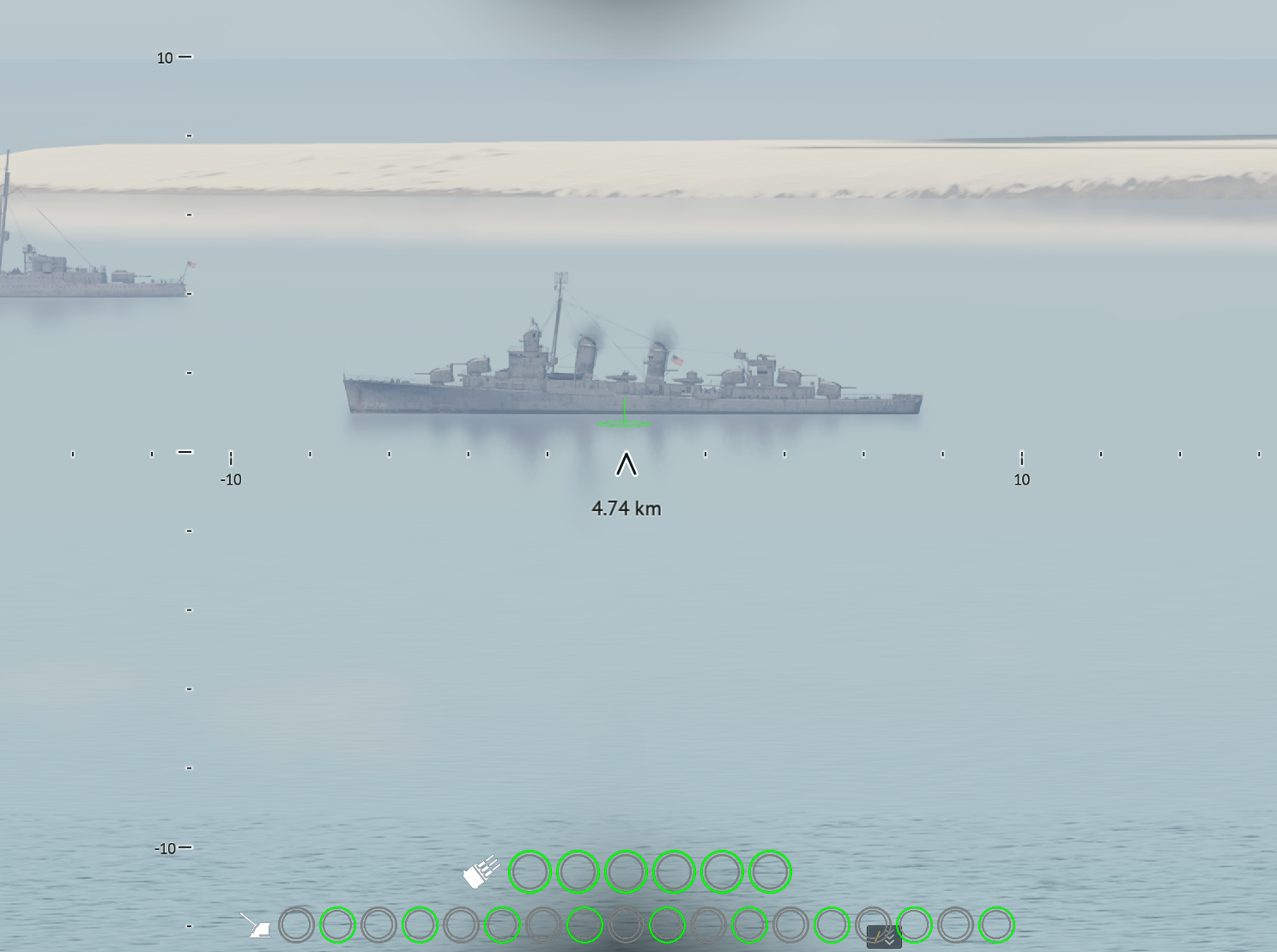
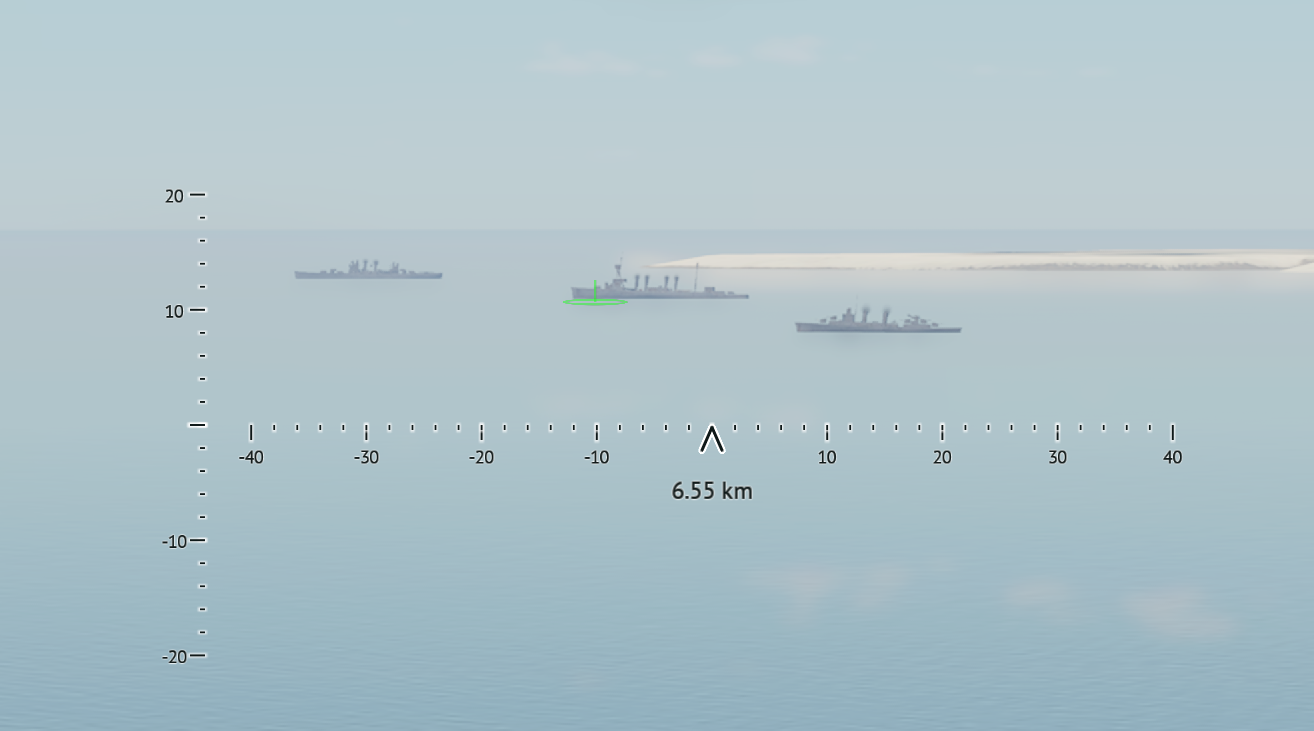
Actual interface
The current system does bring some improvements.
For example, the ability to update the range manually is a welcome addition, as it wasn’t available in the old version. The green aiming circle is also a useful visual aid — it helps players understand roughly where their shots are landing.
However, there are still several issues that make the experience less intuitive.
To begin with, the telemetric error is already present in the interface, but it’s not clearly indicated as such many players may not even realize what that value is presents.
One positive point, the new enemy ship position indicator is genuinely helpful. It provides useful spatial awareness, which is especially important during long-range engagements.
But there are serious limitations.
Beyond 20,000 meters, you can only adjust the range in 1 km increments, which makes it almost impossible to fine-tune your shots with any real accuracy.
There’s also a problem with the single aiming dot: when holding down the fire button, the shots don’t always land where you’re aiming. That’s because you have no visual indication of which guns are firing. You may be wasting salvos without realizing your guns are misaligned.
This makes accurate firing harder and less satisfying. A better interface would help players clearly understand where their guns are aimed, and allow them to manage distance and corrections more easily.
Lastly, there’s an issue with the range indicators themselves:
the two critical distances (actual range and corrected range) are shown on opposite sides of the interface. This separation makes quick comparisons awkward, and it’s easy to confuse them in the heat of battle."
Here is my idea in picture to show how it could represent.
In addition, i think it need to have an option to be able to select wich aiming we would like.
Spoiler
Regards.