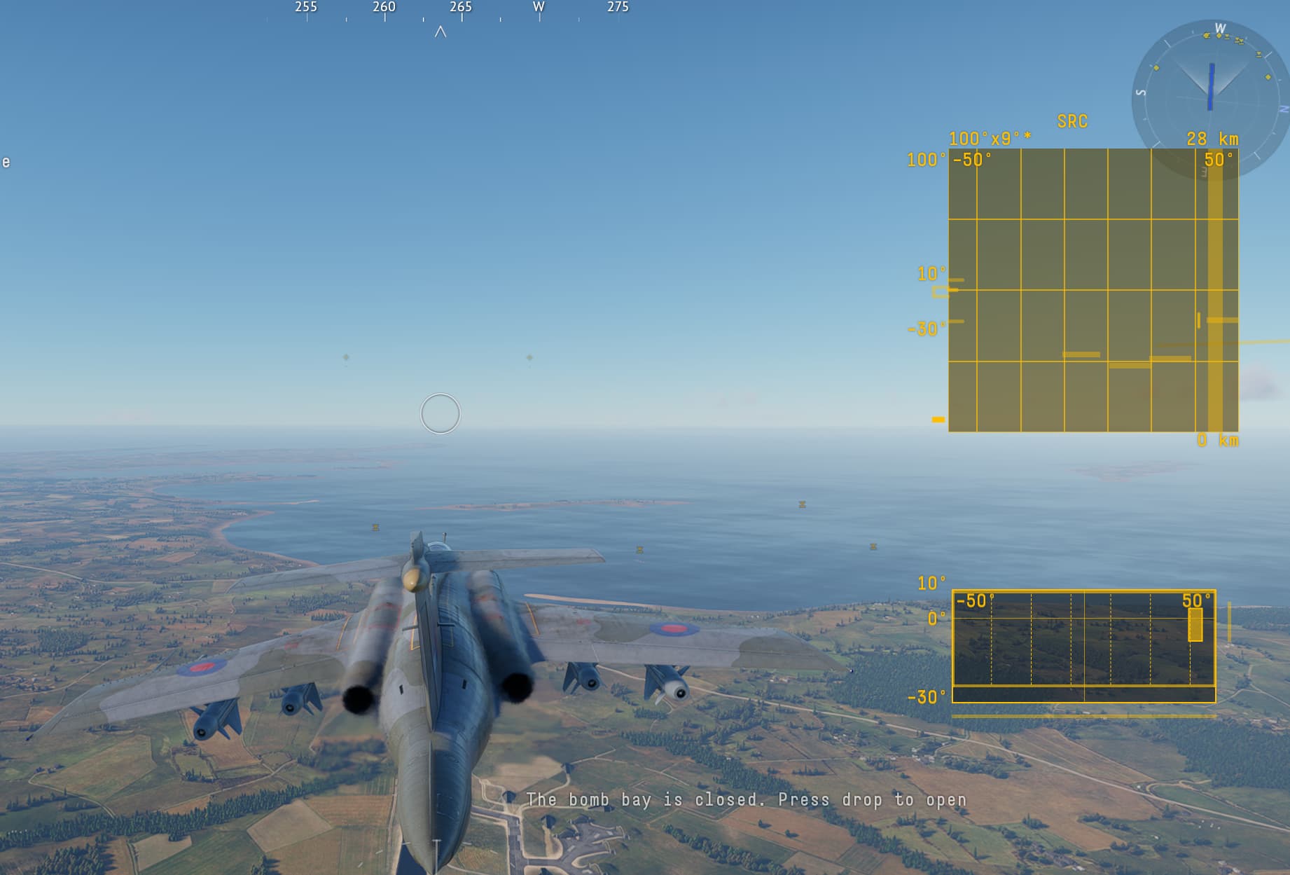
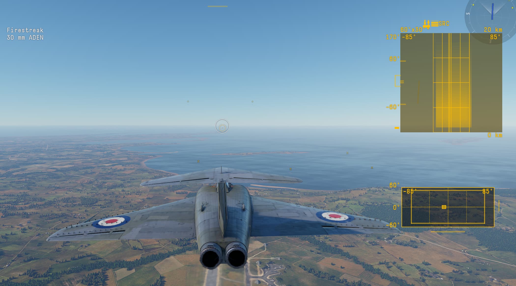
Looks fine to me xD
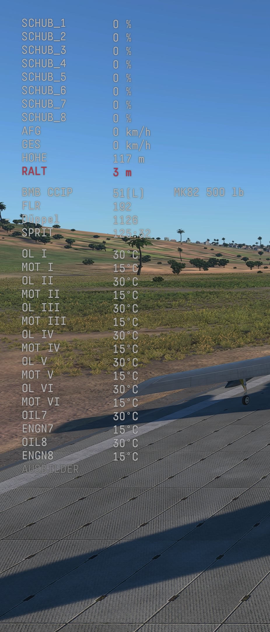
(Just turn off the RWR)
The UI element should not be clipping like it shows on your screenshots. That is
However i myself cannot replicate the issue. So i am not sure if it is something to do with your monitor size and/or aspect ratio. I myself is using a 27 inch 2560x1440p monitor, and tried with both larger UI scale, Air Radar scale and a lower resolution at the same time.
you could have turned that off 😐
Why would i?
I want to have as many data aviable to me
Okay, I just tried the B-52 with manual engine controls.
I can definitely see UI elements such as Radar and RWR should be at least moveable on the screen.
Its radars with B-Scope (or might be C-Scope?). Try something like the Buc S2B or Javelin.
It probably needs bug reporting tbh, but its another example of the UI being buggy, and im not sure how this kind of issue is possible with a properly designed and consider UI.
ok yea its actually 
supposed to have all this all those buttons and numbers everything not even a 10th of what it should have
I can see it now. Yeah, that is bad.
I did try both Javelin, Bucc S2B and Sea Venom, all of them have the same UI issue.
and thats with the minimap small. Cant find the setting to adjust its scale
The graphics settings for it is very confusing, because the compass at the top right, is the one you can scale, and it is called “Air radar scale”.
With the name “Air radar scale”, you would think that would adjust the scale of the radar UI elements, but instead it adjusts the size of the compass at the top right.
You are right, that is it!
Thats why I cant find it :D
If i really have to rant about one UI element. Then it got to be the crew skill screen, I really hate the way one thing about it is designed. Overall, i don’t have too many things against it. While yes, it would be nice to be able to select the vehicle straight from the crew skill menu, instead of going to each vehicle individually and selecting crew skill on them.
The biggest problem I have with the crew skill UI, is the way the crew skill bars are orientated. Most of the world, including the country where the developers are situated, reads from left to right.
So when I am looking at it, and see my vitality is 7/10, i would assume the bar just underneath the text is the one where i can increase it with the XP Points, that was how it was before the new Crew Skill menu were introduced. However under the text is instead the “pointless” skill bars from expert and ace crew. It would look much better, and have a lot better readability if they swaped them around.

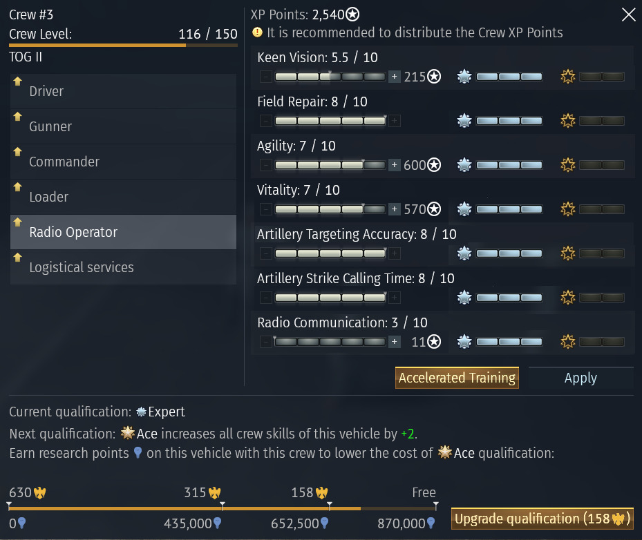
I could do an entire dissertation long rant on crew skills, but yeah, the UI looks cleaner than it did before, but the information isnt actually displayed any better
just gimme a crew that can fly at this point 😭