The UI - Enough is enough

Another update, and even more random, un-asked for and totally unnecessary UI clutter has been added with 0 configuration options

What was just added:
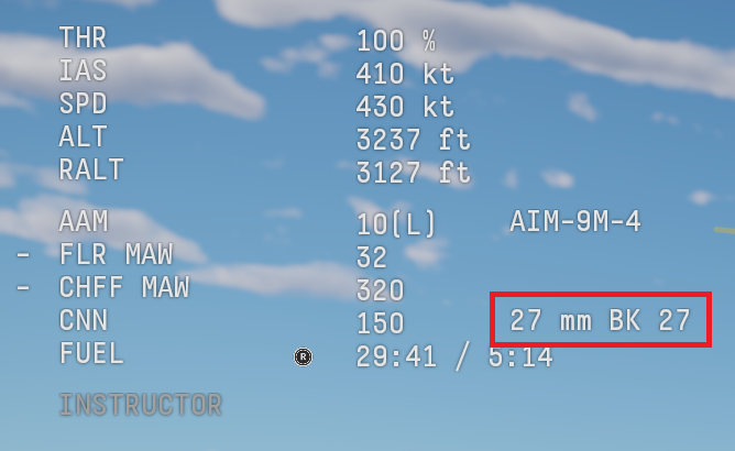
Screenshot 2026-09-16 150041

It now tells you what gun you have. This information is totally irrelevant in most cases. I can understand at lower BRs where you might be using primary weapon selector to cycle between 2 different gun types for aircraft that have them (such as many props), but if you only have a single gun, why is this information displayed at all.

I do not need to know or even care that I have a 27mm BK 27 in this aircraft, or a 30mm ADEN or whatever gun it might be.

At worst, it should be a configuration option to toggle and not just always displayed.

But this is not the only place UI configuration needs to be heavily improved.

image

Weapon names are also displayed above as well when you have multiple in the same idea as above, why are all shown? and if Im only running one type, then why do I need to know at all?

This needs to be changed to a setting with 3 options:

  • None
  • Only equipped/selected
  • All

Let players configure this however they want.

Alternatively, they could just have the name displayed on the left. So instead of saying “GBU” it could say “Paveway IV”

Especially annoying as it also tells you what you have selected at the bottom of the screen too:

image

Which again, cannot be configured at all, I would very much like to be able to enable/disable each message type at the bottom of the screen, a few are useful, most are not. Especially when running mixed keybinds which are often times needed. For example, Brakes, parachute and throttle down all on the same keybind, and you get:

image

warnings all the time. Yes… I know I cant open in the air, I dont care.

Just let me disable these prompts individually

It likewise tells me the keybinds for using the weapons, which thankfully disappear after a few seconds:
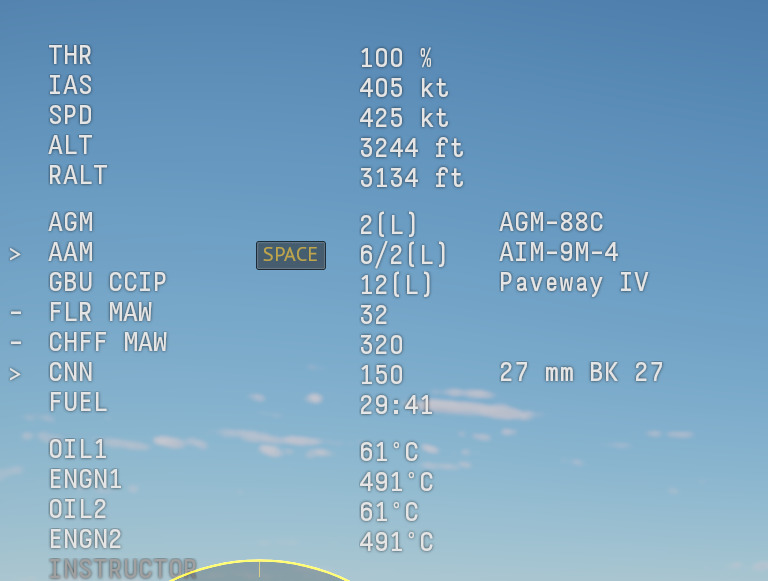
image

But why I do I want to know this, again, just let me toggle this off entirely.

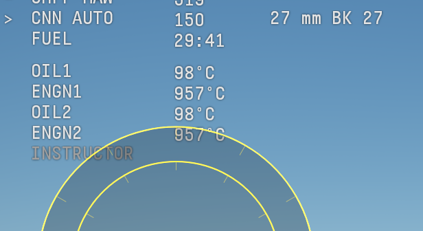
Then another issue:
image
image

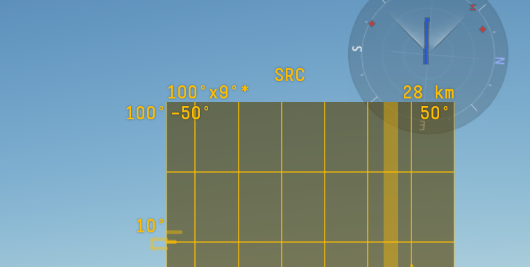
The UI overlap all the time, where 0 consideration has been given for 2 different elements interacting with each other when one is bigger or in a different position than assumed. This really shouldnt be happening in any game in 2026. Though ideally, just let the player configure the scale, opacity and position of these elements.

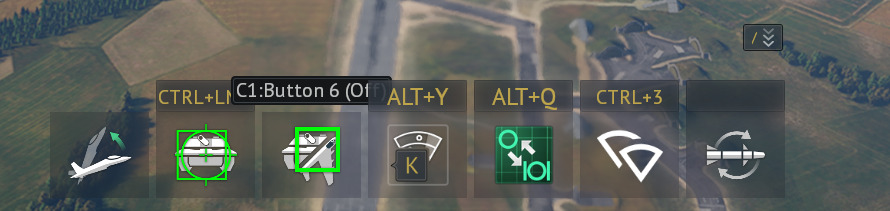
As a final note, this bottom bar really should also be configurable. Allow players to choose what they do and do not have displayed:
image

now granted, unlike the other elements, this can be hidden and revealed quite easily, and I often just leave it hidden, but it would still be nice to make better use of it by having half of this disabled, and only show what I want.

To conclude, it is time Gaijin fix the in-game UI, and significantly increase UI configuration. You may like some of these aspects, you might not, but the core point is, let the player decide what they want to have shown

Is it time for the in-game UI to get an overhaul?
  • Yes
  • No
0 voters
4 Likes

so your complaining about it telling what gun you have but you need to know what bomb you have?

2 Likes

If I have more than 1 type of GBU, then I need to know which I have equipped, and thus which im dropping.

If I only have 1 GBU equipped, then “GBU” is more than enough information.

What isnt needed is “GBU” AND “name of GBU” AND “you have selected said GBU”.

Its just unncessary to be displayed in multiple locations, especially in instances when I have only one GBU equipped.

The gun is even more unnecessary. In most cases, I cannot change the gun to another, I cannot switch between guns mid-flight. I know what the aircraft has, and so telling me is just total nonsense. Only time that information would be useful is on props. like say the spitfire, where I might be using primary weapon selector to switch between 303s, Hispanos and both.

On something like a Tornado or Typhoon… its just clutter for the sake of clutter.

it says GBU then you complain it says what kind of GBU at the bottom of screen then you want it to say the type of bomb instead of GBU

It currently has:

GBU | weapon count | name

It oculd instead say

Name | weapon count

Signficantly reducing the size of the UI in the top left and simplifying the information. Though if I only have 1x GBU equipped, then GBU is more than enough information. I dont need both the name and type.

if a player is skilled they would want the gun type to remmber the fire rate and jamming

what if a player doesn’t know what a spice bomb is

If the player was skilled enough, they should know before they hit “enter battle”

I know the gun, the guns position, what ammo I have selected, etc etc before I even enter the match

2 Likes

Then they shouldnt be trying to use it.

And that is entirely irrelevant given im suggesting at its core, that they make it configurable. let each player choose what information is and is not displayed.

right and how would they know if they just bought a vehicle for example when a new vehicle comes with same gun on a vehicle your good at after noticing that in battle a player would know how to use it

They check first?

Like they’ve done for the past 13 years?

and again. Make it optional. A simple:

Weapon name display in interface: Yes or No or only with more than 1.

done, sorted, simple

Buddy most players know what gun a plane is by the aircraft alone we do not need an intrusive UI element for this.

All F-16s are gonna have a vulcan
All Euros are gonna have a bk27

so on so forth.

1 Like

and if you entered a match, after not checking when buying or afterwards, didnt notice when looking at the ammo (or selecting the ammo for a premium) and got really confused why it was different to what you were expecting, you would just check before the next match. So at worst its a first battle issue

“then they shouldn’t be using it” actually rage bait how is a player supposed to know if its there first time using the plane or going up in a BR with GBU or trying a new weapon “they know because they know” right

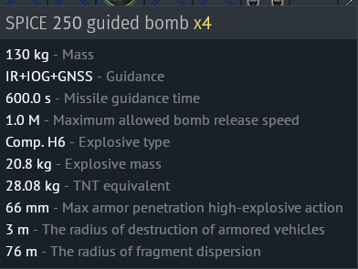
If you set up a custom loadout with spice-250s for example on the Typhoon. Then I would assume that the player would have:

  • read the tooltip

Screenshot 2026-09-16 154051

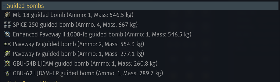
  • read the category the weapon was in in the custom loadout

Screenshot 2026-09-16 154104

and if they still dont know what it was, taken it into a test flight first and tried it out.

I still see 0 argument why the UI needs to be this cluttered:

image

Just show what my currently equipped wepaon is, or change the type to the name. In either instance, you halve the size of the UI shown.

And AGAIN LET THE PLAYER DECIDE!

If you want it all shown, then select the option to have them all shown. If you dont, then toggle it off. There is no argument for having it always shown, for everyone, even if thye dont want it shown

you also complained about your keybinds when you have something like X+Y for manuver mode and X for pitch then its going to pitch when you press manuver mode that’s a controls problem on players side because at many times it is needed to use more than 1 button

I don’t believe even you do that : gets agm88G decideds to read a useless stat sheet how will this help in game? it wont but just because

Hu?

My issue is the unnecessarsy warnings at the bottom for things I dont care about or need to know about.

For example, for my HOTAS setup, I have the dual throttles and I have the second throttle set up for wing sweep or vectored thrust. no aircraft has both and I dont want to be manually switching between controls each time I switched aircraft. So both are setup for the second throttle.

But if im in a Tonka, I get warnings about not having vectored thrust and in a Harrier I get warnings about not having wing sweep.

I know, I dont need to be told that, just let me toggle those warnings off.

I also dont need to know that to fire a missile in ARB I need to press “space” . Again, just let me toggle that off.

Hu?

What are you on about.

If I got AGM-88G, I would instantly see its an ARM.

I now know what it is?

so it says “invalid opening speed” the speed is invalid its simple as that its telling you to slow down without it players would be wondering why its not opening