Thank you, but I knew of this method. I’m talking about click on crew and then see all vehicles, with points allocated, where I could select from crew menu where to allocate the points, It was much easier to manage the points. Of course I prefer also the old menu. I think this was an uninspired way to improve the UI.
4 Likes
My issue is the ability to swap between the Air, Ground, and Naval skills. That was possible with the old UI.
Now, you have to switch your lineup using vehicles for that specific game mode. Just to observe and add points to use for it.
Did they forget about a scenario for those that already max their crew skills, and want to dump those extra points for another game mode? Doing it this way now is more of a burden for the user. They should have been caught this during the testing phase. While it is not a bug, but it is a QoL feature that benefits the user-experience.
6 Likes
Let’s take in-match UI as another example. You enter a match, want to see someone’s vehicle, press tab, move your cursor on that name, and a window pop up.
Now you decide to move your cursor away, rightward. What does this mean?
A. You end up inspection.
B. You want to rather check this guy’s(or other guys’) username/profile.
Guess what? Our dear Gaijin decide that you want this window kept there!
Have the UI devs ever thought about ‘why users make that move’? This is not even a problem of art style preference, but whether there’s still any sanity! :(((((
3 Likes
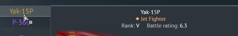
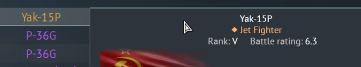
Can’t see all the vehicles of the crew?
Can’t switch between Ground/Air/Naval?!?!?
Also it just looks like a total chaos.
This is moronic.
Please just revert it to how it was.
5 Likes
This happens when I hover my own vehicles in the hangar too. The info screens like lock and stay up despite me panning my mouse away…
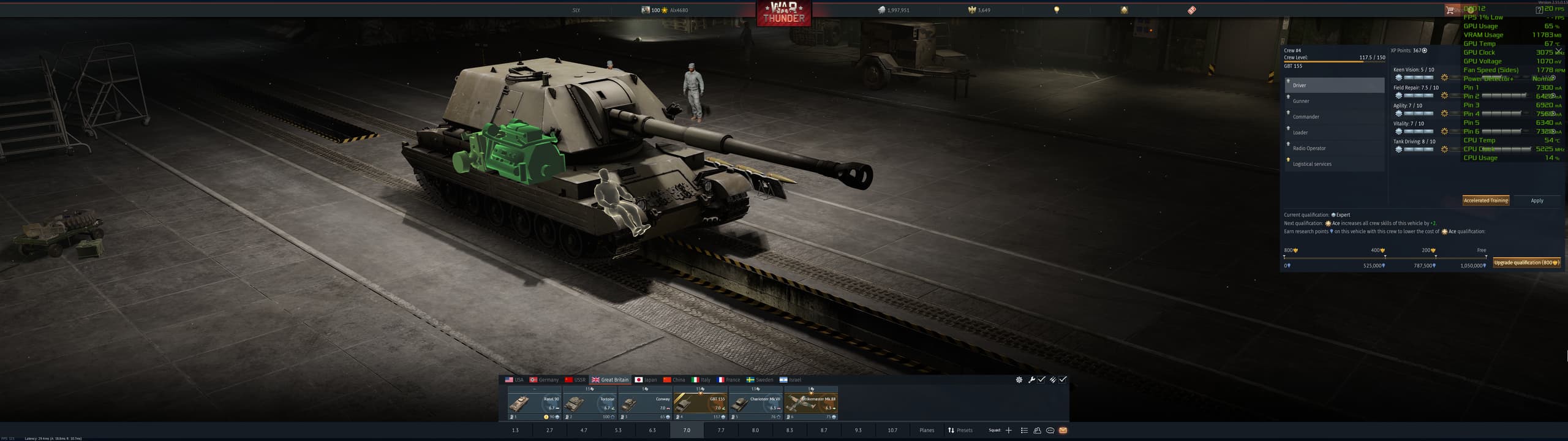
This is one of the biggest issues with the new Crew Skill window. Also, you cannot see the other vehicles you have already trained in that slot anymore.
2 Likes
Can we please get an option to re center the ui? it is absolutely insane having it on the far right. if you have any sort of an ultra wide monitor it is not even near your tanks. If you are using any kind of overlay the menu gets covered and you need to hide your data you keep open just to see the game stat card.
1 Like
This member group interface makes me feel nauseous and want to vomit. It’s hard to imagine how there could be such an ugly UI in 2026; it makes me physically sick.
2 Likes
THats somehing new. So they DID add it with new menu?
It’s been there since the update went live, i don’t know about if it was there on dev server, i didn’t play on the dev this time around.
Well update went live yesterday evening, so i wasnt able to play and see any changes. And it wasnt like that before update when i wrote the message
lots of unnecessary flash that hides the actual information.
TL:DR: it sucks
2 Likes
Is the worst, I don’t even fking know what I looking at
1 Like
I know change is not easy for many and some people’s language may be a bit too harsh but i’ll just say this:
Spending time on this kind of stuff while we have many things to be fixed in the game is just “bad”, lack of a better word.
And I just hope the developers will get the feedback.
1 Like
It was obviously programmed by someone who doesn’t use it.
4 Likes
This was made by someone who doesn’t have to use it, but has to justify why they’re employed and thus has to put in “busy work”, and who was told that the Ace Crew/XP buying needs more focus and to stand out more.
1 Like
I said this with the last major content patch that featured the ui changes to the vehicle interface and pop up windows. I guess they actually changed what I was most mad at.
The majorest problem with the new ui change here with the crew xp window is that the dingus used some default stance on text margins.
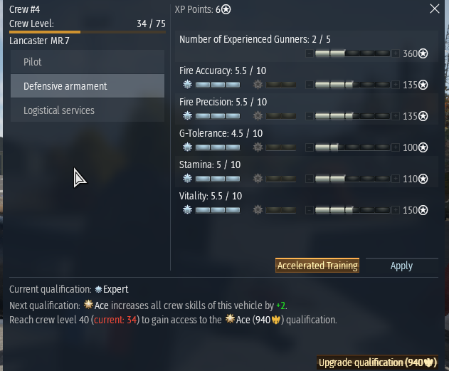
As you can see at the top “Crew #4” and “XP Points: 6*” are margined to the Left of their respective columns which might work on the eyes when you are looking square at the window like in this isolated screenshot, but when it’s shifted to the far right tophand corner of the screen “XP Points: 6*” is Center to the whole window, not just the column. This is count-intuitive for the eyes since that Center location is normally reserved for the name of the entire ui Window.
The problem is made worse when trying to visually sort the list of where to assign crew points. As you can see, the top item “Number of Experienced Gunners: 2/5” has no benefit from Qualification Upgrades, so that section is blank, and the “Number of Experienced Gunners: 2/5” text is fixed and Margined to the top Left which is no longer ordered along the same axis line as the crew points allocation bar. In other words, every time you assign crew points, you have to draw imaginary diagonal lines from the Text label to the point allocation. Again, this might not be a big issue if it were centered on the screen. I’m assuming whoever designed this was looking square at the window in the design interface. It would make more sense to have the point allocation bar below the text and the Qualification bonus on the other side. Regardless, it’s dumb. The goal was to show off the effected vehicle components which required compressing the crew skill window. This could be a problem due to compartmentalization of the team.
All other concerns in the thread are valid.
@Alx460 It’s bad even on square monitors.
The idea that UI designs are fine, and that it’s just a matter of players Progressing through the changes… it’s insane. I don’t understand why you guys can’t just come up with a good UI or make gradual changes.
The only problem the old window had was that some items on the list at the bottom were cut off and required a minor scroll down. A simple resize would have sufficed, but it got an entire revamp.
The color decisions are the most obvious indicator that whoever is making these changes has no idea what they’re doing. Even the Plus button looks like part of the xp bar, so having a filled xp bar looks partially blank because of the dark button.
However, the bottom portion is not bad because the xp bar is more prevalent and clear. The Left margin makes sense for the “Current Qualification:” portion because it’s not a split column window. That being said, it would still be better off Centered imo, but there’s not as much confusion there. I find it boneheaded that there is no xp tally indication (like “You are at 110,037 xp toward next Qualification: Ace”), and when you hover over it, you get redundant information about the expense required per step, which is once again, completely boneheaded, another total indicator of incompetence in design.
7 Likes
The old one was bad. New is terrible. I like the info what the max lvl is.
A step back from the old UI imo - You can no longer select aircraft, tank or ship tabs in the crew skills menu, nor see what vehicles they’re trained for.
4 Likes
You guys should be trying to create an entirely new viewing mode of vehicles with a separate option like
Change Vehicle
Modifications
Customizations
Test Sail
Crew
Information
and add your dream window: Inspection
or something. Might be too close to “Information.”
Then have the vehicle screen pop up with the list of components/crew with the mouse hovering visuals. Integrate it with the x-ray tab or something.
Integrating it with crew xp is just spastic.
Addition:
You also don’t know if you have the lions for the crew training until you either hover the icon or try and click it. Kind of annoying.
1 Like