But are you literally supposed to read the manual for a microwave to , wtf
If your microvawe has no UX design and instead just throws a bunch of unlabeled random buttons at you - yeah? That would be Gaijin’s microwave, that people defend with “read wiki, duh”.
Independent of the microwave having a good interface, you’re supposed to read the manual, just as with a game as complex as Warthunder, you’d read the game’s wiki.
Okay guys, lets see. I sit in an attacker aircraft and I have bombs. How should I realise that I will get more points by ground pounding AI-units than by dropping bombs on Bomber bases?
- I will have to read wiki.
- I will have to calculate my income after a battle by analysing Excel sheets of targets and rewards I got for them.
- AI-units will look brighter and more valuable for me than bomber base targets that will look dimmer and less valuable for me as an attacker.
Because in WarThunder, ground AI targets are small red icons all over the map and bomber base targets are big red “target” circles that beg you to drop something at them. No matter which class you sit on right now, they look big, valuable and easy both for bombers and for attackers, and for fighters, for some reason, as they cannot even interact with them.
What if… think about it… the game had a narrative design that tells players naturally that they better do X?
Yes, game gives you total layout damage and points multi , bases hp per br is public use math
Or what if…think about it…
The stat card had a section where it says “Reward multiplier for destroying ground targets: 1.2x” for example?
And if that is still too complicated and you still go “Huh, what’s this?” you could google it or go into the games Wiki to look it up.
Dear god, plain text, yay, the magnum opus of design. Why should devs work had to make playing a game more natural, if we can just put a bunch of text somewhere…
Its so… not diegetic… Its like that placeholder for a mission in Heli PvE, where instead of telling your objective somewhat fancy like “rescue our troops located at A and transport them to any base”, will just put a plain, bold and tasteless: “Capture point A in B3 grid square”. And do with that what you want, dear player, we just told you a placeholder plain text and you should be grateful for the ruined atmosphere and immersion.
You can change game text lol
Sure, a player should make a normal game out of sandbox assortment of placeholders. God, even sandbox games have actual narrative design…
And in Nuke Thunder, it seems, they gave up and just threw players inside a match without any descriptions on what player’s actions do and how it all works. Because a player can, apparently, read somewhere the rules by which AI targets spawn or what this big radar on a hill do and what will happen if you destroy it… Surely, its all described somewhere? I just can’t find that.
They make somewhat complex (by Gaijin merit) ground targets logic, but fail to describe said logic to players. So it all looks like there are just a bunch of randomly spawned targets here and there and for some reason now there are more blue units than red ones.
You make a right issue out of something as simple as doing a bit of research I know your generation can’t hold their attention, but come on
I wonder what is your birthyear or at least a decade of birth, you just assumed “my generation” and now I’m curious what is yours.
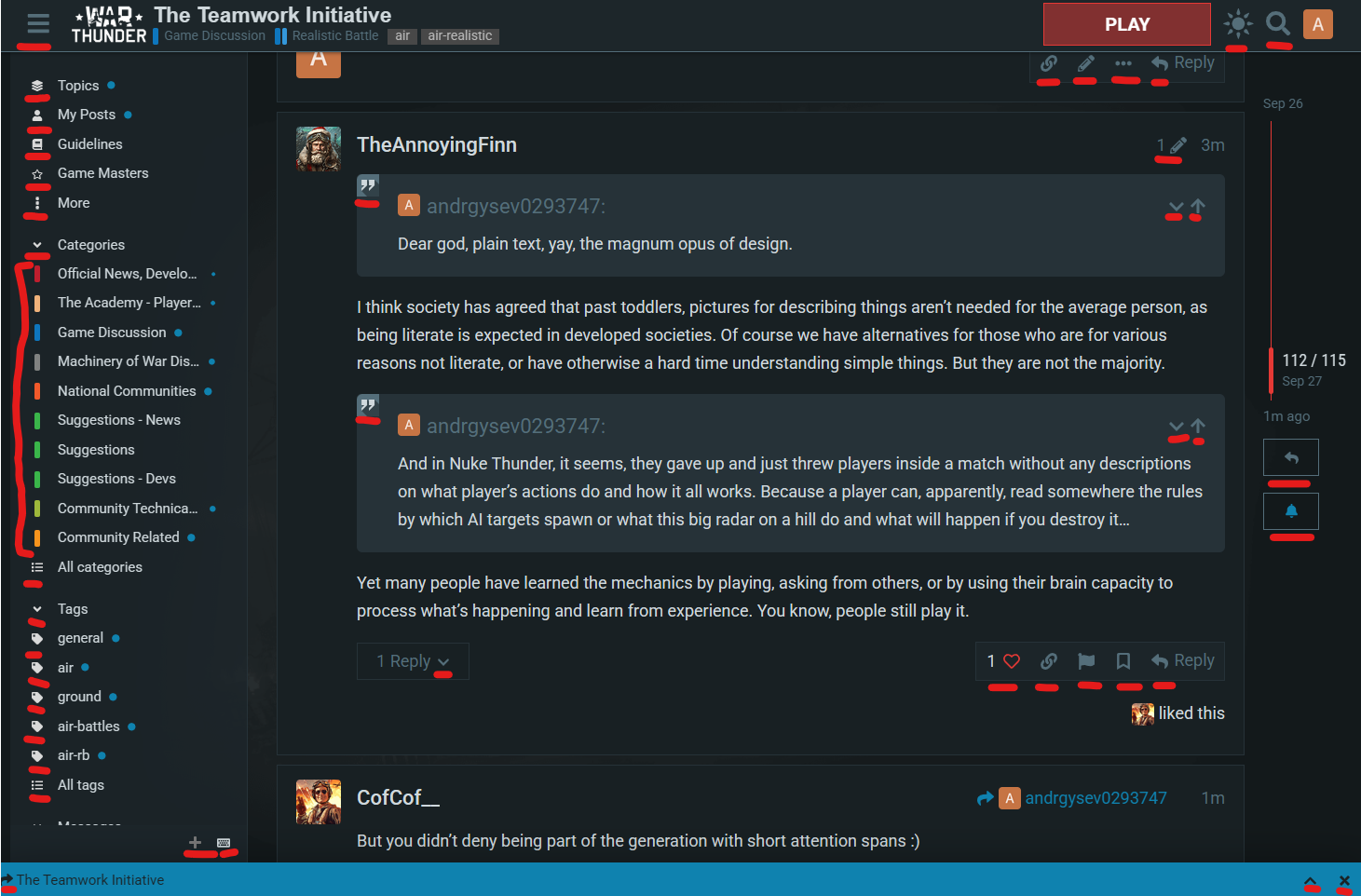
I think society has agreed that past toddlers, pictures for describing things aren’t needed for the average person, as being literate is expected in developed societies. So we use plain text, or in the case of more complicated things, graphs, blueprints etc. Of course we have alternatives for those who are ,for various reasons, not literate, or have otherwise a hard time understanding simple things. But they are not the majority.
Yet many people have learned the mechanics by playing, asking from others, or by using their brain capacity to process what’s happening and learn from experience. You know, people still play it.
2 Likes
But you didn’t deny being part of the generation with short attention spans :)
And if they want something better, they should go ahead and change it themselves, or find someone to do it for them

So, you won’t tell your generation, thus I assume I may actually be older than you.
Generation theory is dumb, also, except the latest generation that grew and lives with nearly universal worldwide internet access and see nearly the same things and culture everywhere. They did grow up nearly “the same”. But for “generations” before it all breaks apart with differences between each country.
Pick and choose type of argument, but i’ll explain it to you, since it seems for some reason necessary;
Expecting people to read while driving would create unnecessary distraction and risk, literally putting peoples lives and health at risk. Do better.
And as for the forum page example you used, colored small icons are generally used for faster visual recognition and easier navigation, along with other similar benefits.
If text wasn’t the societally accepted method, why are we using text instead of icons to communicate on these forums? This is the level of argument you are using.
Also you yourself wanted to have text to describe mission objectives in the game, just better description. That is exactly what you are suggesting, plain text.
Please try to stay consistent
Sure, I already know that the best UX-designed microwave is this abomination:

I agree, pictograms are useless, I wonder why people even learn UI/UX design, bruh, just have a manual!
No difference between a text in a manual, outside the game, on wiki or in a specific loadout page.
And a text inside the mission that tells you your… mission… clearly…