- Yes — modification to the new HUD
- Yes — revitalization of the old HUD
- No
- Other (explain in comments)
First off, I would like to clarify that I do not hate the new HUD introduced in “It’s Fixed! №87”. The old HUD for “Battle” mode was extremely confusing, and I am glad you have decided to update it. However, I believe there are a few things you could do to further improve it.
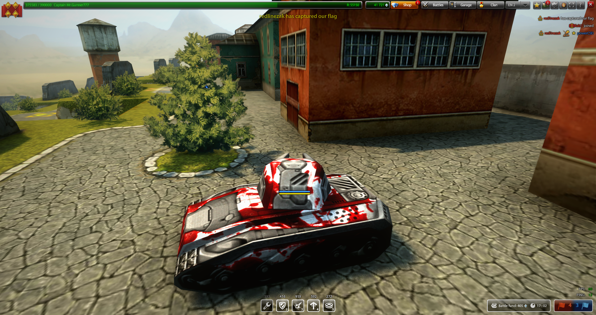
To put it simply, the new interface is very “arcade-y”. The design is reminiscent of something you would see in something like Battlefield or Overwatch. While this design works very well in the games I mentioned, it clashes with War Thunder’s theme. To illustrate, consider a similar game, Tanki Online.
For the longest time, Tanki had a very gritty, “used future” aesthetic. Here’s a good screenshot. However, when they were switching over to HTML5 (the game originally used Adobe Flash), they switched over to a very arcade-y aesthetic. Here’s a screenshot of the redesign. This different aesthetic drove a lot of long-time players away; it made the game feel like a bubblegum-y arcade shooter instead of a vaguely post-apocalyptic tank game.
Again, I am not saying that interface redesign is bad; it can be done well. For example, as much as I dislike the game itself, World of Tanks has done a pretty good job of revitalizing their interface over the years. It’s just important to remain consistent with the game’s spirit. In my opinion (and, from what I can tell looking at the War Thunder subreddit, the opinion of many other players), the aesthetic of the new HUD clashes with the game’s aesthetic.
As such, here are two ways I have thought up to (hopefully) fix the HUD:
- Modify the new HUD. Change the color palette and glossiness to match the darker, more matte nature of the old HUD. Perhaps turn the chevron/arrow bits displaying each team’s score into parallelograms (like in the old ticket counter bars). Above all, get rid of the janky +–sign effect when a team gets a kill. Seriously, that effect looks like it came straight out of Overwatch.
- Revitalize the old HUD. Return the ticket counter bars, and display the killcounts, goal, and time remaining as text below it. Here’s a rough mockup (please forgive my horrendous Microsoft Paint skills):

Again, I am not saying to just go back to the old design. The killcounts, timer, and more obvious mission goal are all much needed features that I am extremely glad you have implemented. I just think that the aesthetic of the UI could use a little tweaking.