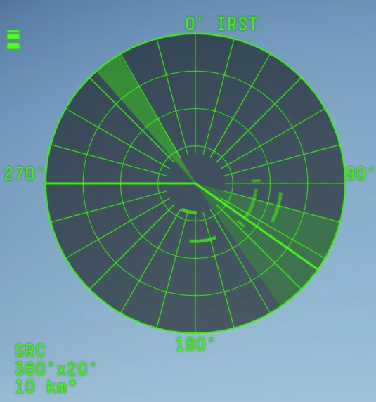
With the new update followed a new look for the third person PPI radar screen.
I hope that you revert this graphical decision as it’s worse in almost all ways.
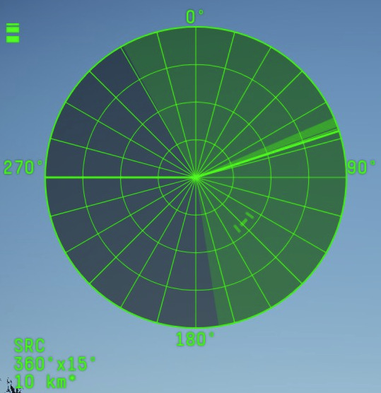
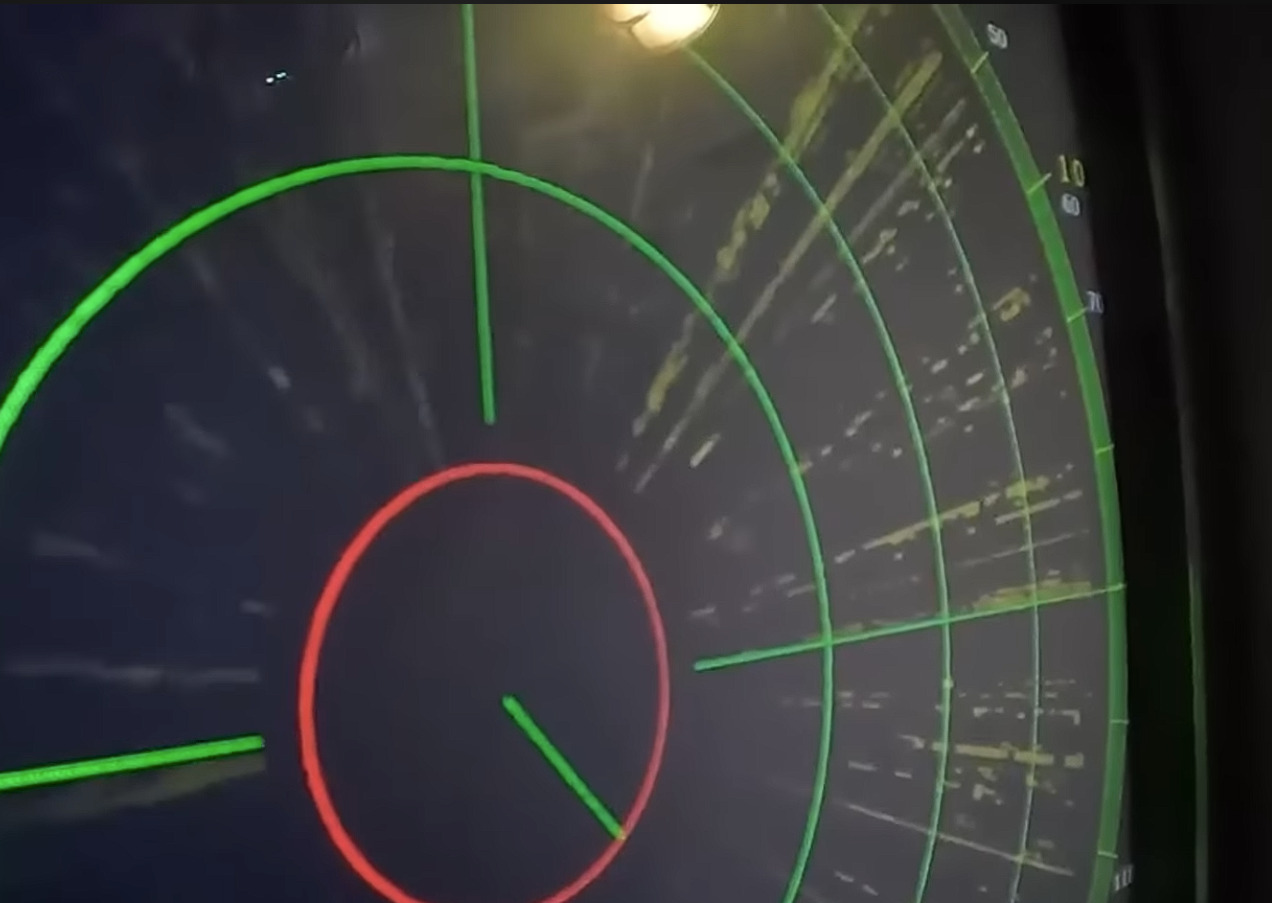
Lets compare the new:
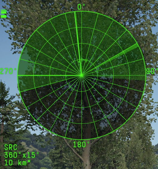
to the old one
The first most obvious issue is the line clutter from all the additional directional lines. This 200% increase in lines makes it harder to see which is the priority target when two or more contacts are close together:
The second issue is the loss of weapon information the old one showed approximate possible engagement range which made target prioritization easier as it effectively added range information to the range lines with out cluttering with numbers:
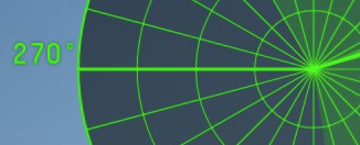
The third issue is the random fat line on either 270 or 90 line, this looks like the turret direction line. This line is just confusing
The only good thing is that the lines are thinner
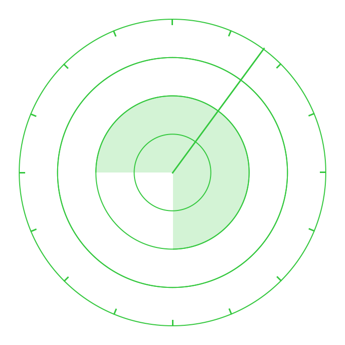
So please revert or fix, here is how I would like it to be improved:
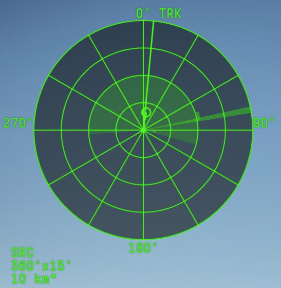
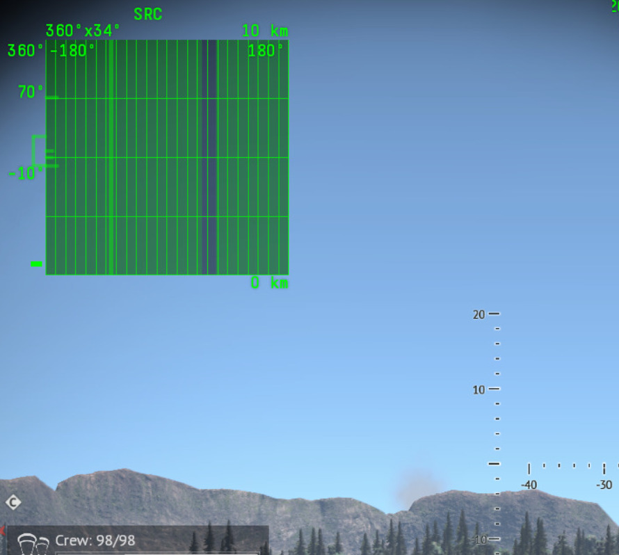
Lets look at the current Roland scope:
There the directional lines are not meeting in the middle which makes the scope much easier to use, all directional lines should be removed or shortened so they only appear on the outer edge, they add almost no information to the user so they are just clutter for no reason.
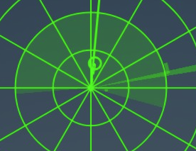
Something like this would be prefect:
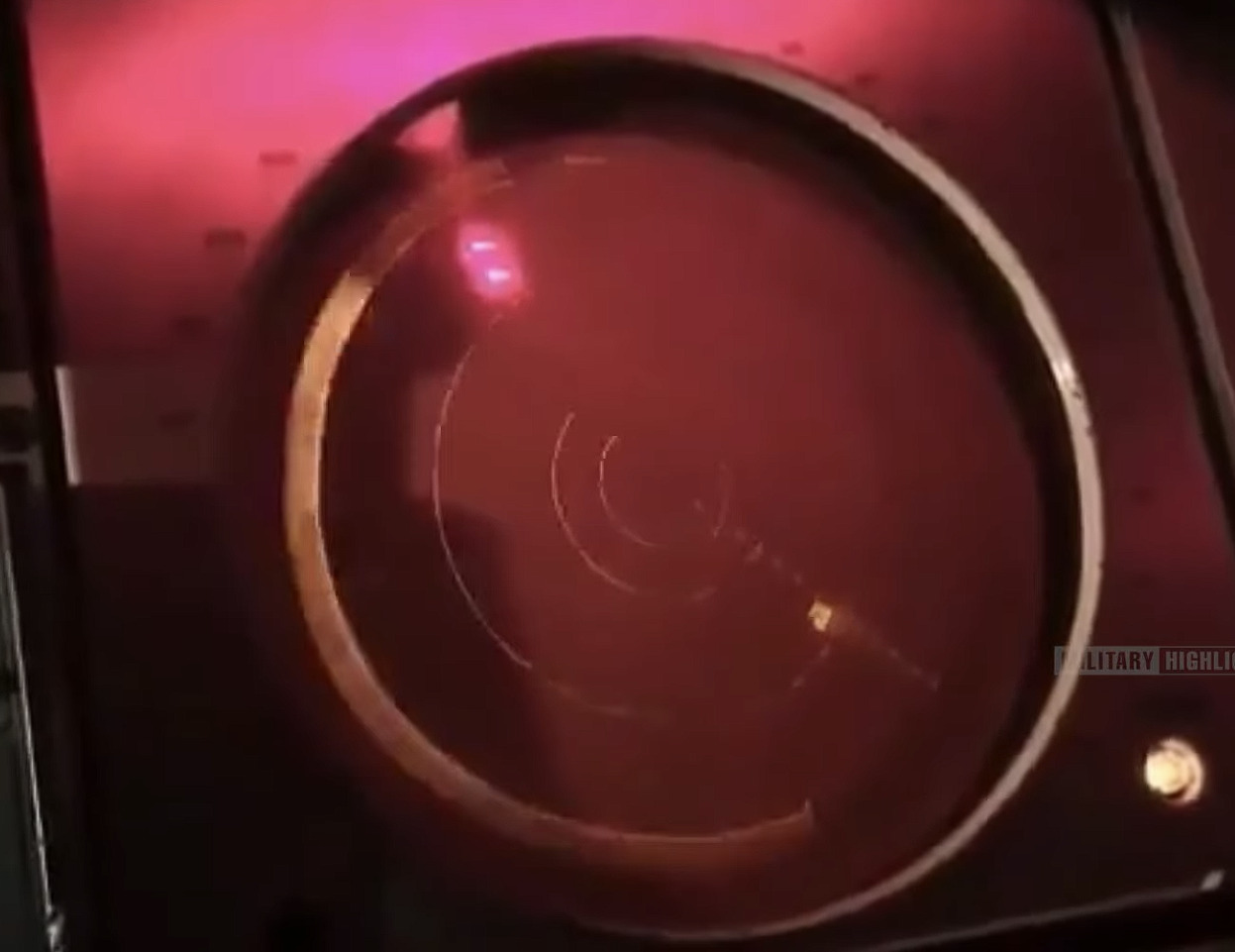
It would also be more realistic, as that is how most radar displays actually look:
i sometimes wonder what the dev server is for.
It was cluttered on the dev server, people complained, it stayed that way. same with the new Air radar UI.
Its filter just hid the target without actually filtering them out, people complained, it stayed the same.
Well that makes me think that they adopted the aircraft radar code for surface vehicles, which could be good in the future. But the current application sucks.
Cant imagine why it would be good.
Oh and that new UI is on every ship what I’ve tested.
That black line on right side of that screen is where your ship is facing so there is no actual way of reading that screen since it changes position depending where you are heading, only that there is something flying somewhere :D
Only thing what should be fixed is jumping lead indicator when getting planes / helos on radar lock. and this applies to all ground and naval radars
I can be good in the future because you have much better interaction with radar controls on aircraft in game. Surface radars just spin with a fixed elevation which is not always historically accurate. Adopting the Aircraft code I assume can result in more interactive radar gameplay where you have to control the radar to look at the area of the sky you want to search, it can improve gameplay.
Some radars allready have it on game.
ZSU example does have that , you can make it 360 or 180 or something like that.
But that PD radar screen is just not what it should look like.
Also elevation angles can be changed on some vehicles, like TOR.
Seems like UI designers develop UI outside of game. Crew and radar UI seem to prove that. They just changed interface without taking into consideration how it will work in game.
That is sector search(rotation limitation), it’s not steering the radar like you can do on aircraft. You are of cause right about the look. In the old days you could switch between circular and square scopes on some AA vehicles so lets see it that will not be added to ships also.
Yeah , but on that rotation limit, you can adjust general direction to where you are looking insead waiting to full rotate, handy in zsu where it is slow as buk’s rotation.
I could use that PD look if I would have limited rotation / scan area just like in jets.
But when having 360 scan that does not work.