Player Profile – UX Improvement & Customization

👋 Introduction

Hello everyone!
First of all, I’d like to introduce myself. I started playing War Thunder back in 2015, but had to stop during my university years. Now in 2024, I’ve returned—and I’m amazed by how much the game has grown, especially with the addition of ground and naval forces. It’s now a much more complete and immersive experience than before.

As a UX Designer, I noticed something important: the new player profile layout, while visually updated, removed some valuable functionalities that were previously available. I’d like to suggest a possible improvement that brings the best of both worlds: modern design + meaningful customization.


🧩 UX Insight

In UX (User Experience) design, one core principle is:

“When modernizing a layout, never remove key functions—especially those users are already used to.”

Unfortunately, the new profile screen:

  • Offers only one central customization block.
  • Leaves large empty spaces (dead zones) on both the left and right sides of the screen.
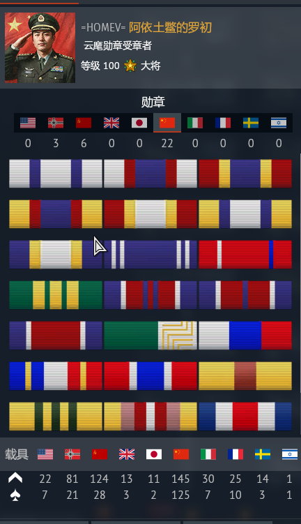
  • Removes detailed player info and customization options that were previously available.

This limits personalization, removes the sense of progression, and leaves the layout underutilized—especially in a game as rich as War Thunder.


✅ Proposal Summary

My suggestion is to keep the new visual layout, but reintroduce customizable info blocks so players can express themselves and highlight their progress.

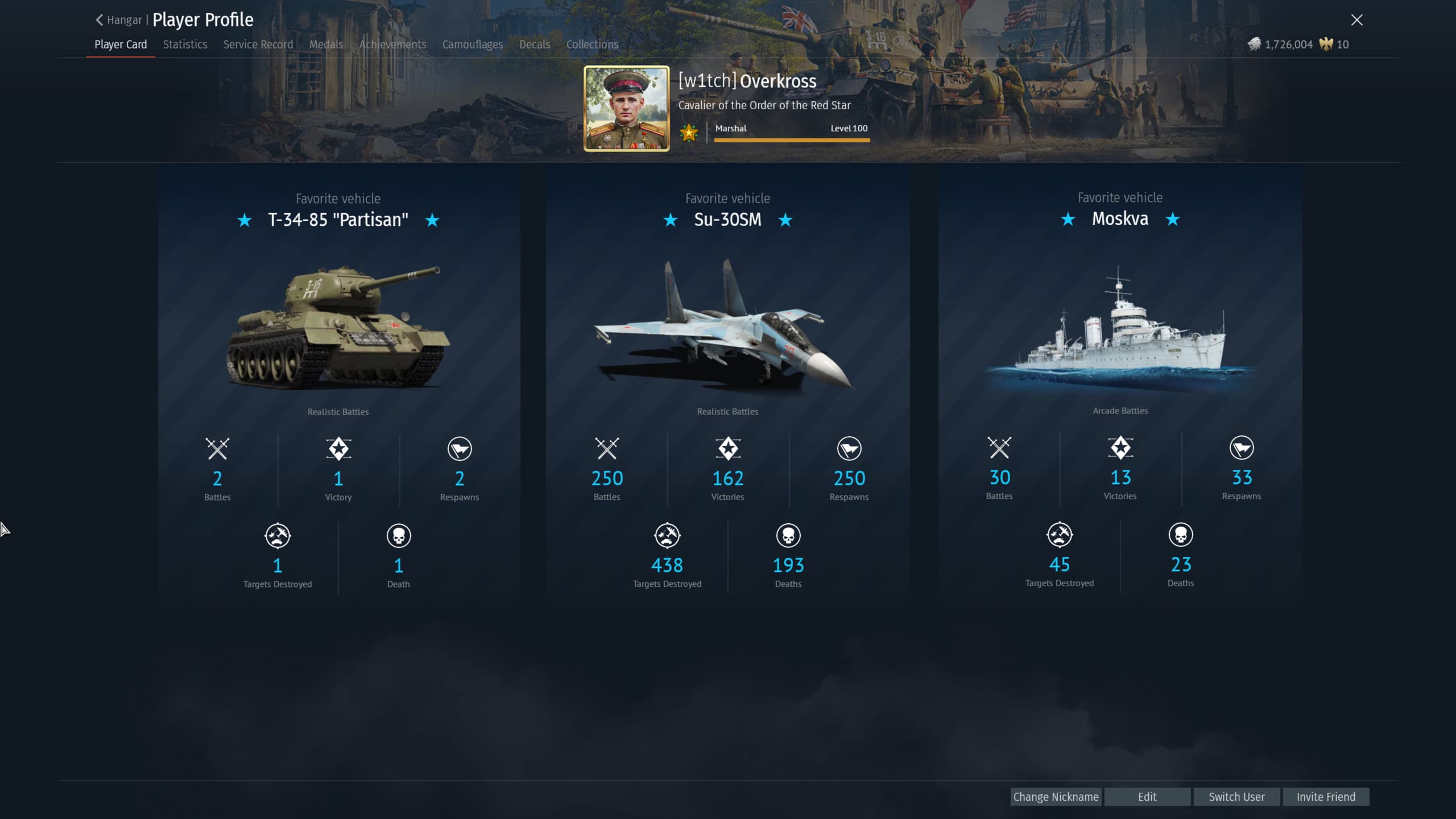
🔹 Concept 1: Simple Layout (3 Favorite Vehicles)

  • Customizable blocks to show:
    • Favorite ground vehicle
    • Favorite air vehicle
    • Favorite naval vehicle

🔹 Concept 2: Expanded Layout (Stats & Achievements)

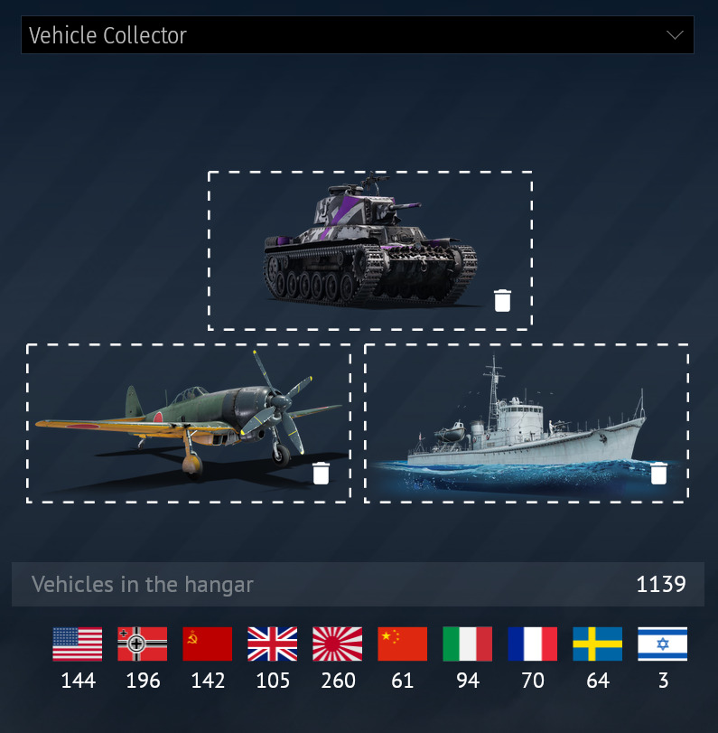
  • Total number of vehicles per nation
  • Favorite vehicle across all modes
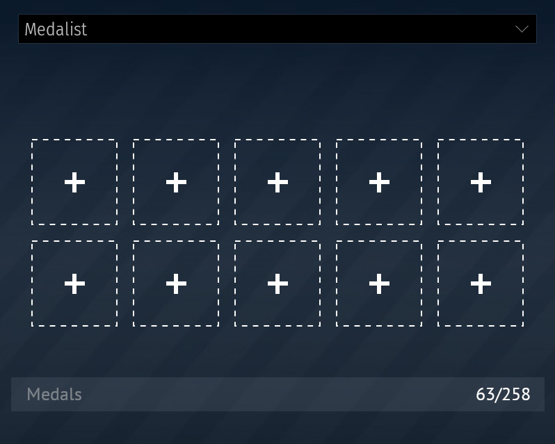
  • Earned medals
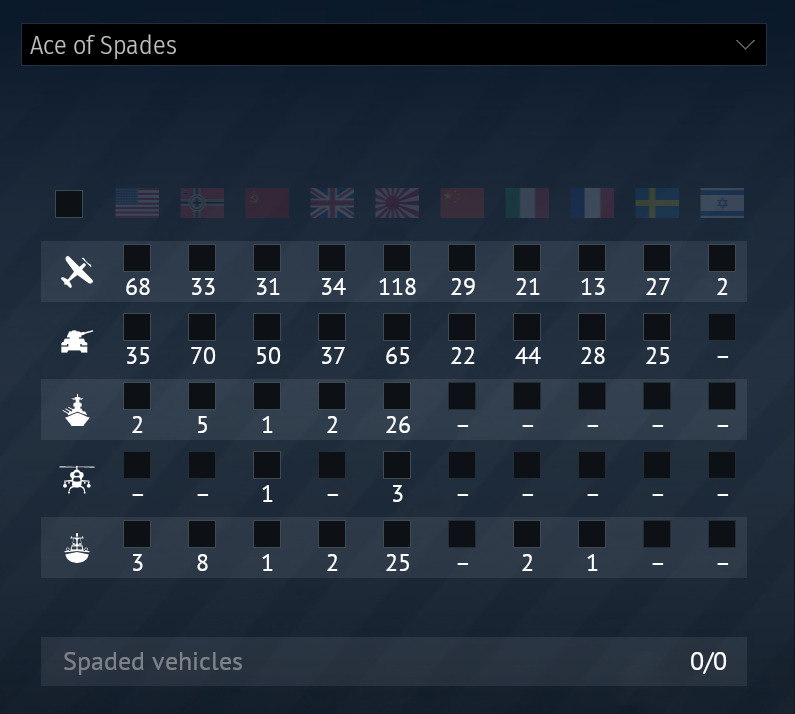
  • Other achievements and player milestones

✅ Each block is customizable — players can choose what they want to showcase.


🎯 Why This Matters

  • Makes each profile unique and personal.
  • Increases the sense of progression and achievement.
  • Improves social interaction when others visit your profile.
  • Uses screen space efficiently (no more dead zones).
  • Adds long-term player engagement through customization.

🗣️ Final Thoughts

This is just a friendly suggestion from someone who loves the game and works in digital design. I believe this could bring more value and identity to the player profiles.

If you agree with this idea or would like to suggest additional features, I’d love to hear your thoughts in the comments!

Thanks for reading, and see you on the battlefield!
— A UX Designer & War Thunder fan

[Would you like to see this in-game?]
  • Yes
  • No
0 voters
6 Likes

+1 This would actually be really nice, maybe it could also display 9 (maybe more) vehicles if you select vehicle collector 3 times?

AI generated ahh suggestion.

4 Likes

+1 would be nice to have these, especially being able to have medals and units at the same time.

such a shame to see a good idea being written with Chat GPT without even trying to cover it

8 Likes

Image_1721046312782
I hope to restore the old version of the medal table

4 Likes

If I can have 3 Vehicle Collector slots, I’m all for it.
9 vehicle showcase yes please.

1 Like

It’s just AI… aslong as it isn’t being use to proof of something exists.

Yes please.

This specifc section of the old profile has essentially all the things that I actually looked at in there and it’s a shame they split it into three blocks that can only be displayed one at a time.

The old medal display looked so much better, and actually displayed all the medals for all nations. It was nice to have since medals actually felt like something that was individually displayed on the profile. Trying to complete medals in a nation felt like it meant a lot more than it does now where “medalist” only displays 10 select medals at a time with a dry number of medals out of all 258 under it.

image


Then the list of researched and spaded vehicles per nation was a great way to keep track of how many vehicles you had per nation as well as how many non-spaded ones there were so you could easily see where you might want to spade another vehicle or continue research.

I do like the display of vehicles in “vehicle collector”, but I don’t think it’s worth sacrificing a capability I actively used from a UI design perspective. I still use it, but having to edit and switch to “ace of spades” is inconvenient, especially when seeing the dead space that could easily fit it.

image


“Ace of spades” itself is nice, the only issue is that it doesn’t show spaded vehicles out of the owned ones, but out of a total. It is nice to see a vehicle total that wasn’t there before, especially with the ability to select the displayed total by checking boxes though, so as a concept it’s nice.

image


Most of this can easily be fixed by both giving three slots at a time so “vehicle collector” and “ace of spades” can be displayed at the same time with an additional panel for “medalist” and the dead space used to a level where the profile actually looks like it’s complete.

Then personally I’d want either medalist improved or a new panel added that lets me become this guy again.

2 Likes