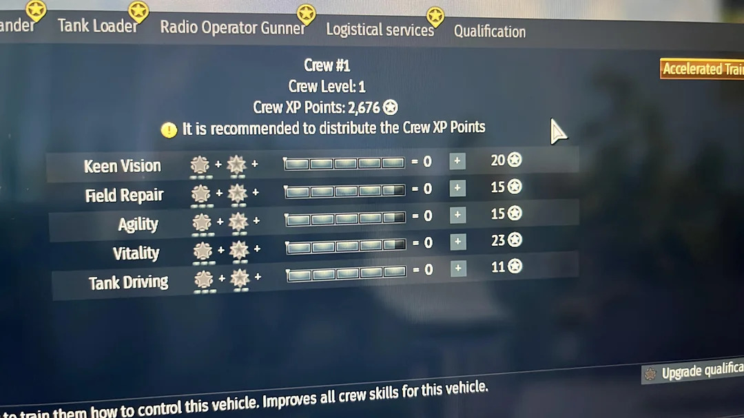
every time I open the game after an update something in the HUD/UI changes and its so UGLY like the bar now under your plane like there is in tanks but in tanks its useful in planes it makes it ugly why are we dumbing everything down and making the game ugly they now made the crew upgrade screen horrendous the game gets ugly every time I open it why are we changing a screen we have nearly sense the game started to an uglier one that older players have had for years does anyone agree?? I really don’t know why after so long why are we changing it not like the old one was hard to navigate unless you have no brain cells which seems to be the player base gaijin is leaning into with every update of the UI. I know a lot of people think this might not be a big deal but it is to me and makes me enjoy the game much less then I use to :(

i do like the modules being highlighted in the new update.
But I do agree with you that the layout is weird. It could have been done better
Its a cool thing to highlight them but at the end of the day it tells us the stats if u hover over them anyways the hold UI was def better looking this one makes your eyes want to go in two directions
I think there should be an option if you want to use the new UI or old one.
the old UI was objectively bad though, personally I do prefer the new one it does a much better job showing how ace and expert crews affect things.
please dont forget that the old one has an inherit advantage in that you already know how it works, if you put the new one and the old one in front of someone who has never seen either and ask them how the warthunder crew skill mechanics work i would be willing to bet that the new UI fares better
Idk when I started playing the UI was pretty straight forward back in 2019 or so so respectfully I do disagree I feel like with the knew one its got your eyes looking both ways I like the old screen and I do wish gaijin would allow us to have the old one if we wished and let others use the new one like a setting if they wished idk if thats hard for them to add or not I have never been into game development js playing it
I agree with you
the old UI at best is on par with the new one in all but maybe the swapping between air/ground/navy
like it really hasnt changed that much
now you can just look at your tank with the relevant modules while doing crew skills, plus its no longer gaslighting newer players into thinking that 5 is the max skill for most things (when it is actually 10 from ace and expert crew)
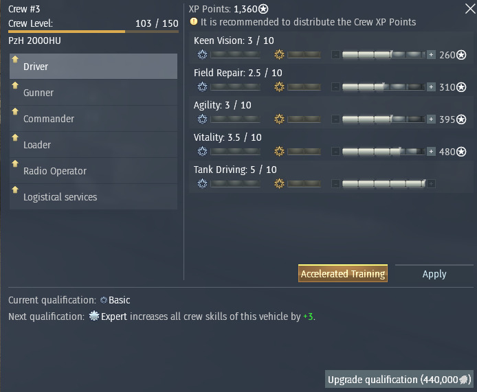
My biggest complaint is the inability to see all the other vehicles already trained of the same type, and the inability to flip between land sea and air.
Just takes time to get used to New layouts. No one likes new UI’s most of the time due to gotten used to the old one. I even forgot how the very old ones were.
The new crew UI really isn’t that bad.
What I do take issue with is the new statcard UI which tells you nothing about the protection levels of WW2 era/anything with conventional armour. The old ones sucked for modern MBTs, but now we can’t easily see how thick a tiger II UFP is.
I hate that too. You can’t even see your own protection levels in battle.
Additionally, I do not like the new Ui, it’s a super cluttered mess.
new stat cards are BAD I have to move my mouse so far to get way from them when selecting a different tank in battle
I think they have existed sense launch but I am not sure
the UI got me looking like dis bruh

Australia and Belgium???
Kingdom of Italy?
just dont look at the tank at the same time bro? its a choice at that point
no there were some massive UI overhauls from 2018-2022
The reduction of function is the real problem.