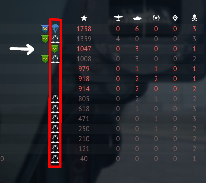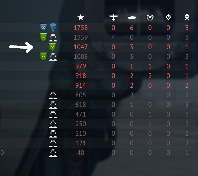
Since some time this shield icon replaces empty space on enemy player statistics line.
It is inconvenient.
Now we have to look closer to icons to see if it is a chute, a dead icon or “shield” in order to understand how many enemy players are alive.
It is impossible now to make calculations in one fast glance, like it was before, when shield icon didn’t migrate thru line in player statistics.
Is it possible to make UI like before, when you needed only to count free spaces in red column?