- Yes, it would greatly help with realism and immersive gameplay
- No, keep sights the same with only one color
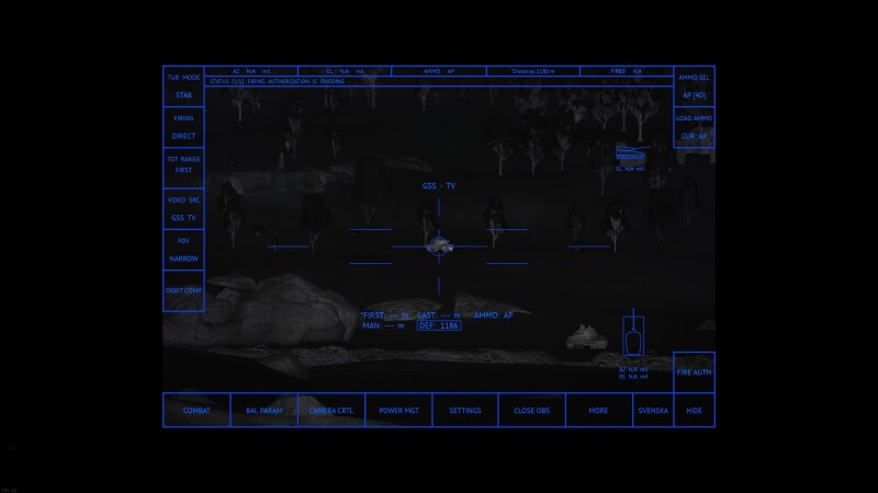
Modern digital sights often use many colors for ease of use and to know where to glance. Only having one color for the whole sight (except for texts with “highlight:b=no”) doesn’t look or feel nearly as good and/or realistic.
Examples of real sights with multiple colors:
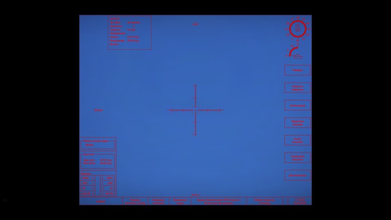
In-game recreations with only 1 color + black:
This suggestion can be implemented easily by making it possible to add a “color” and “lightColor” line to every block (lines, texts, circles, quads) instead of the main “crosshairColor” and “crosshairLightColor” that applies to everything.
Examples:
Quad, standard black, highlight green:
drawQuads {
quad {
tl:p2 = -10, -10;
tr:p2 = 10, -10;
br:p2 = 10, 10;
bl:p2 = -10, 10;
color:c=0, 0, 0, 0
lightColor:c=0, 255, 0, 255
thousandth:b = true;
}
}
Circle, standard red, highlight blue:
drawCircles {
circle {
segment:p2 = 0, 360;
pos:p2 = 0, 0;
diameter:r = 1;
size:r = 1;
move:b = no;
color:c=255, 0, 0, 255
lightColor:c=0, 0, 255, 255
thousandth:b = yes;
}
}
Thank you for reading this and I hope it gets implemented since it would greatly help us sight creators and the sights can be way more realistic/immersive. It would also allow for actual drawings in the sights, which would be very cool to see!


