Hello!
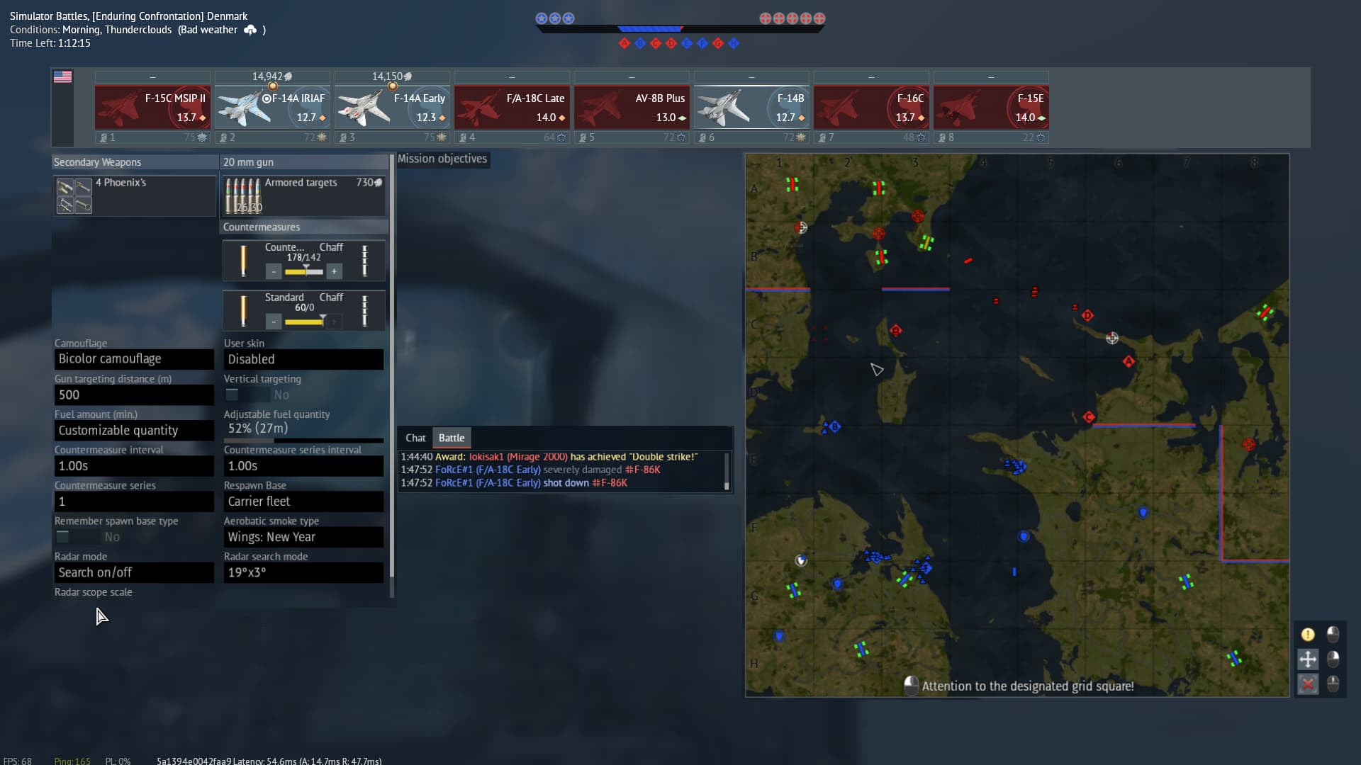
Coming at this from an Air Simulator player perspective I find the way the map, chat, objectives, and aircraft configuration sections are presented to be too crowded and at times unusable, specially at reading either the chat or current objectives.
I am sure some improvements here can also benefit other games modes as well but in a game mode like SB where looking at the objectives list is far more common I believe there is a better way to present all this information to the player.
– Here is an example from a recent game.

–And here is a rough yet simple solution suggestion.
As you can see the suggested change improves the following:
• Way bigger and centered “Mission objectives” section where all objectives would be clearly visible.
• Bigger section for Chat/Battle log in the lower center
• Long “Aircraft configuration” section to the left that would negate the need for a scroll bar.
• Maintains player familiarization only making good use of the available space
Of course all ideas are welcomed that would help make this more clear to read and interact with.
Thank you for your attention to this matter :)
- Yes
- No