Idk is it just me or what, but I would really like to get old UI back. Expeciali for crew skills. Why does it now take up so much screen ??? I get you want more gimmicks in War thunder, and that you want to show your modeling department strength. But could you for love of god at least allow us chose what to see/ use as UI ?
11 Likes
I get what they wanted to do, trying to illustrate which skill affects what part and which crewmember.
The problem is, you have to constantly look in the right upper corner.
For me, who is used to the old system, I find the new one kinda hard to read, even if the skills themself haven’t changed.
The Vehicle takes unnecessarily too much space, and you can’t switch between all the different vehicle types Ground, Air, Naval, Helicopter
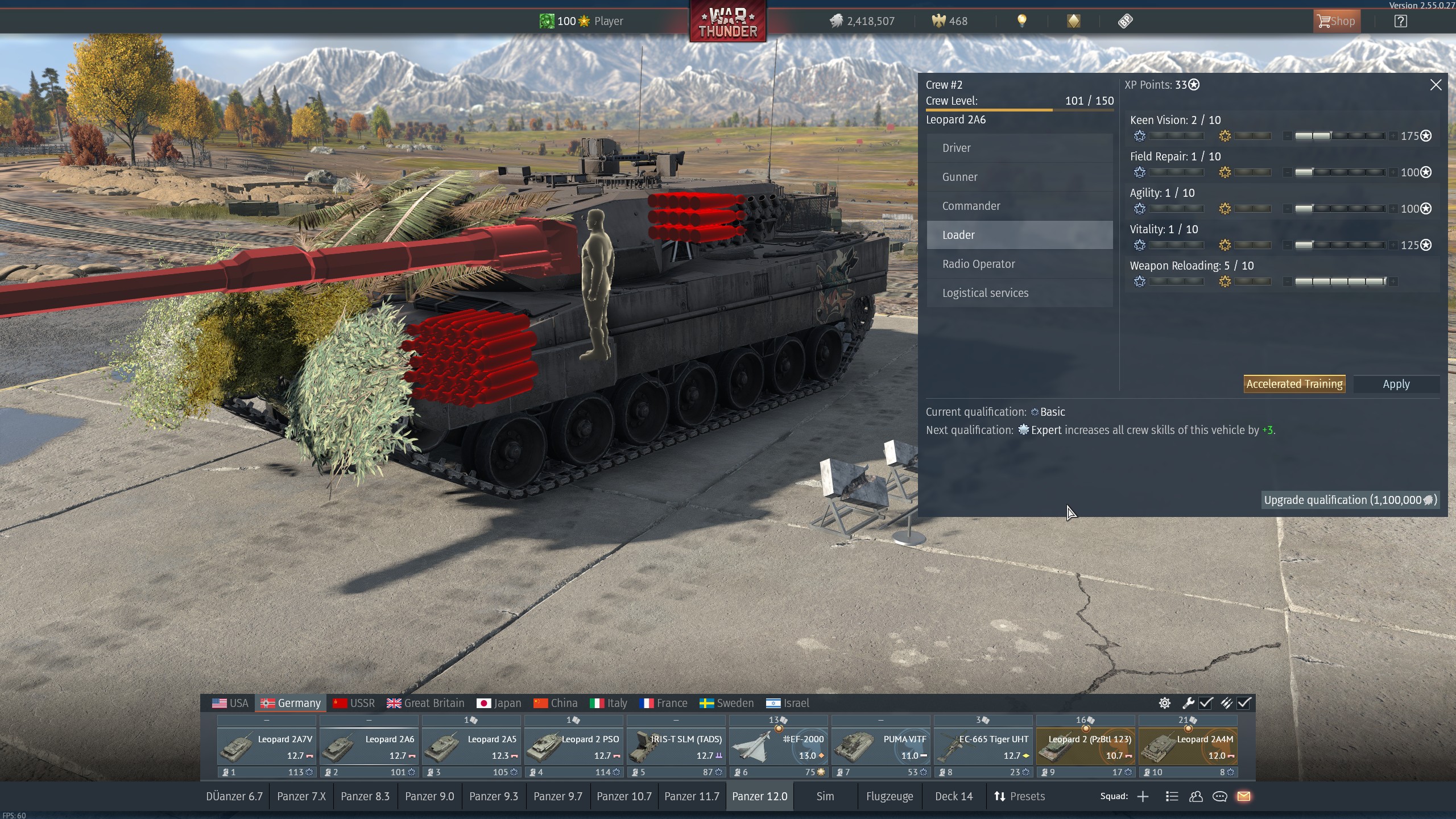
Could you please give us a toggle to show the vehicle or not? So the crew skill windows can be centred. Then it could be made even better UI wise because, right now, for me, it’s hard to read.
P.S. I would love a rework of the crew skills in general, but that’s not the topic of that thread
Edit: In Dollarplays newest video, he has the exact same issue(s)
11 Likes
ngl. the new crew skill screen is better. other than not being able to switch vehicle type youre putting points to unless you put a vehicle of that type on the slot.
1 Like
It’s ok, personal preference . . . just take some getting used to . . but who even asked for this??
Unless this is a way lighter/less intrusive version that does not tax the game’s system,
just why?? This continual need to change things in the UI, if only for the sake of change
just isn’t very good. All I see it do is upset players(some more than others) but it doesn’t
make the game any better the majority of the time(Still waiting for player card to be fixed
as promised)
But the inability to toggle between the 3 vehicle types . . . yeah that totally kills it for me.
I have almost every slot maxed in air(all nations but Israel), I fly far more than anything else.
I “used to” regularly go thru my slots in ANY preset and add crew points to
the tanks and/or naval crew for each slot.
I have 8 slots for RU, all 8 are maxed in all 3 vehicle types.
I have been trying to work up the other nations as well, but now . . .
very problematic . . . we really need a toggle. I cannot understand how it
was even left out in the first place.
Yes, it was a very old feature, maybe even “dated” . . . but the new one is just more
of the same thing(well not more . . lol) with a new wrapper
3 Likes
Exactly. Thank you for putting it all better than I have. I mean look at this screen (taken from internet)
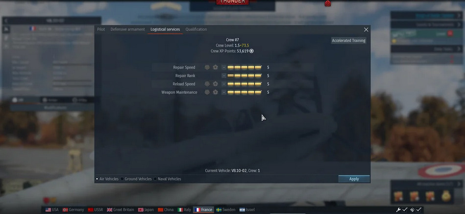 simple and with enough space to add description below how it affects your tank after leveling/ upgrading your crew. But you could also see changes on stat cards (which i also would like old ones, with more info like maximum hill incline, and many others).
3 Likes
I think it’s useful for newer players, but unnecessary for veterans. I’ve been playing for about 6 years (though more casually lately), and that’s exactly why I’d prefer it to be optional—so players can choose which features they want in their garage and avoid clutter.
It’s also a bit funny how War Thunder shifted from semi-realistic toward something closer to WoT (and maybe Armored Warfare). Plus, tutorials on crews, skills, and grinding have been widely available for years, so that information isn’t hard to find.
They should have been honest and made it like this, who cares about the other information.
3 Likes
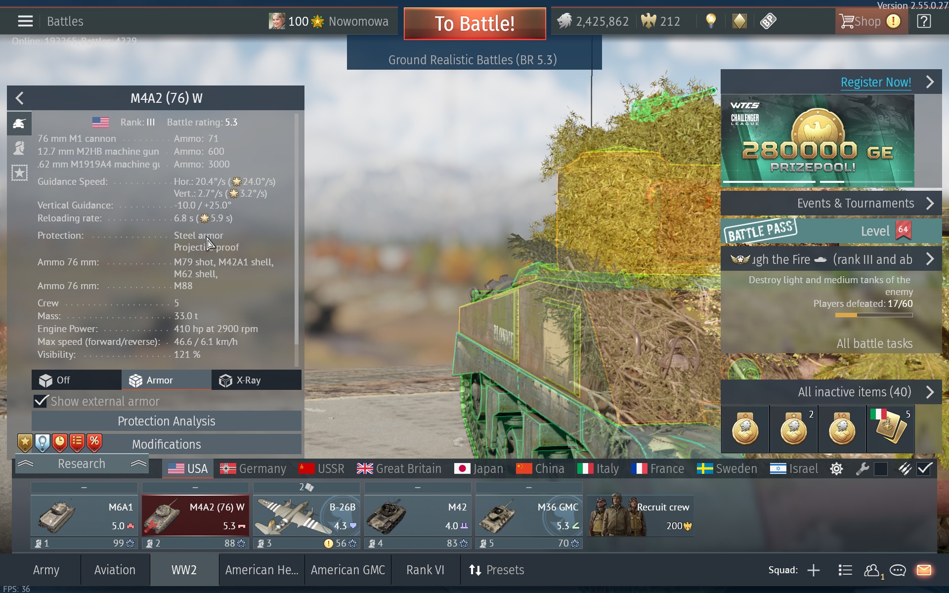
When I saw it first I thought it was a bug. Specially because on my computer it blocks all the real state on the right side of the screen and the vehicle is shown as a slice about 1/3 of the screen width. I feel like 1920 pixels should allow a usable GUI…
Also now I’ve just noticed that the stat data of vehicles no longer features armor thickness, which is
replaced with the EXTREMELY USEFUL information that the protection is… “steel armor” to stop “projectiles”. Woah, you mean it? But then they list all the ammo types instead (surely a new player will make A LOT of use of that data?), so, it’s a lose/lose?
Don’t know what’s going on at Gaygin, but the GUI changes look like someone was replaced and the new person is marking the territory, because both the crew research and the development screen are massive downgrades of screens nobody ever requested to be changed…
PS:
Crew data on my system…
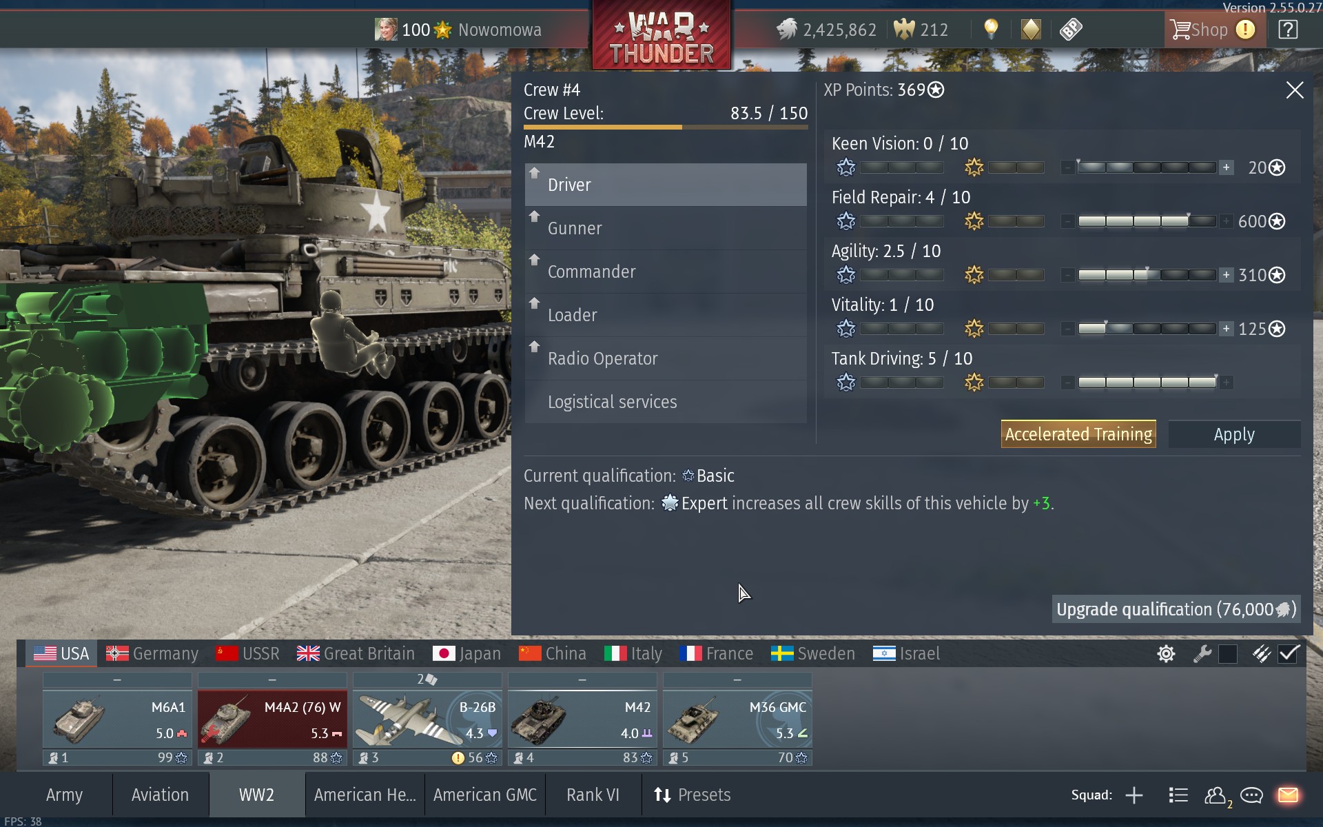
…and you bet it, this tank has steel armor to stop projectiles…
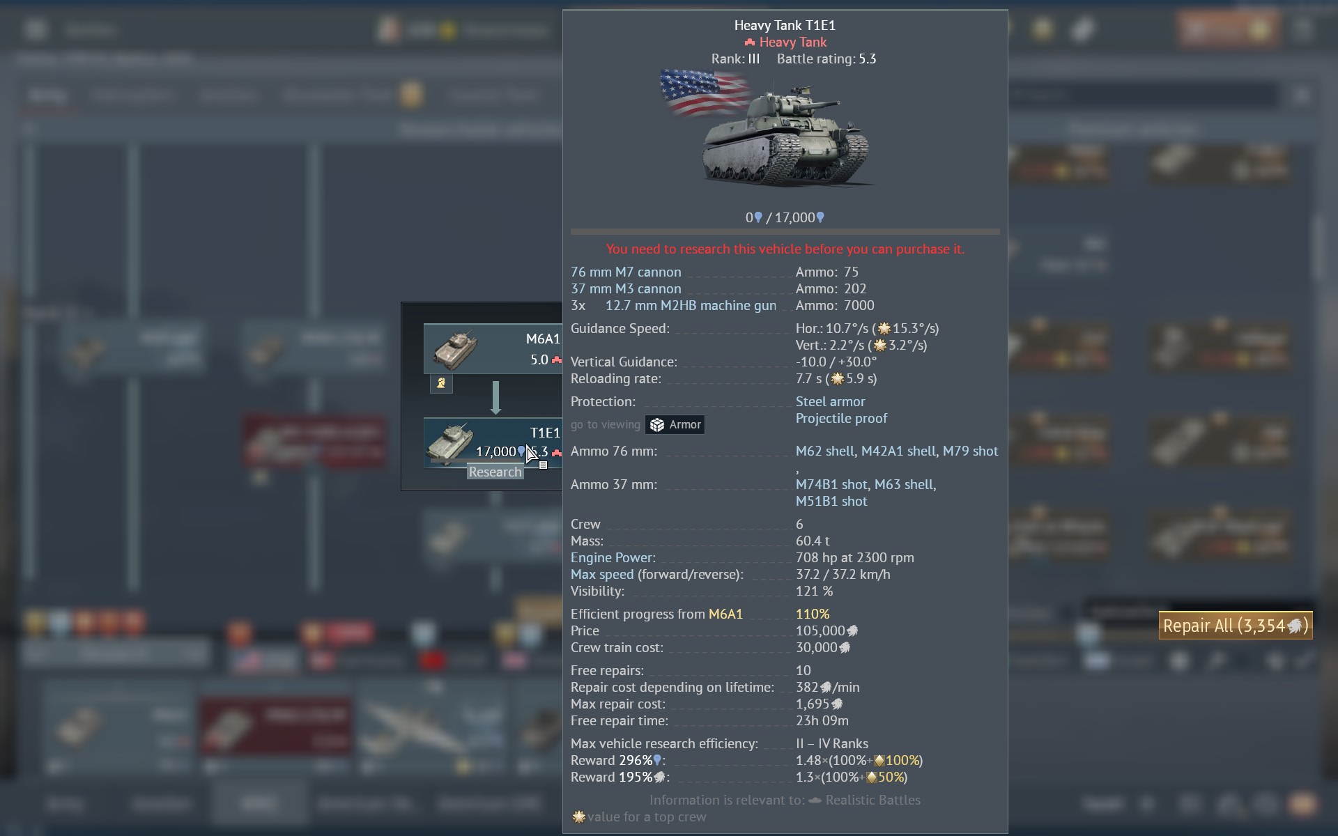
…just don’t ask how much of it. Seriously Gaygin?
1 Like